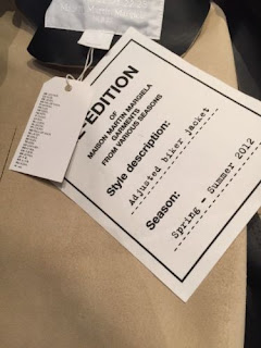
Always consistently black on white
Always iconically consistent typeface
Rarely use images within their branding content
Emphasis is on the design and production quality, debossing, embossing, spot glosses and quality stocks or fabrics
Logotype can be adapted and added to in different ways, introducing the serif 'Paris' underneath acts as an establishment/reference tag, with the alternating typefaces giving aspects of unique differentiability to their product range.
Typeface elements can be expanded and blown into their own features
-Consistent use of Helvetica light
-Consistent use of bold Serif's - initially more ornamental (Saint Laurent as seen above) and moving towards typewriter over the years
-Consistent use of grid and transferability
Interesting ways of packaging products - delivery boxes rather than bags
- Plastic/transparent dustbins and carrier bags for inside luxury bags. Bags which will be given out in shops need to have the an extremely production quality as that is one of the main forms of street advertising.
Additional Research
http://www.vogue.co.uk/gallery/the-meaning-of-margiela
http://www.vogue.co.uk/gallery/martin-margiela
The use of numbers throughout the MMG branding refer to the different collections, although not all of them are in use.
Of the ones they do use, they reference the following:
0 – Garments remodelled by hand for women
0 – Garments remodelled by hand for women
0 10 – garments remodelled by hand for men
1 – the collection for women
10 - the collection for men
4 – a wardrobe for women
14 – a wardrobe for men
11- a collection of accessories for women and men
22 – a collection of shoes for women and men
13 – objects and publications
6 – garments for women and men.
The idea of gender ambiguity within the MMG brand is topical when considering Zlata's clothing, which too is genderless. The incorporation of codes and concealing would be interesting due to her Russian heritage and the collection references.


No comments:
Post a Comment