Logo evolution over time, visually changing to a taller, more slender typeface, maintaining similar x-height but reducing the width of the letterforms. Balenciaga are one key brand to change their logo in the contemporary fashion logo trends showing genderless structure due to the removal of softer feminine accents
- logos often becoming wider kerned
- logo's becoming taller instead of wider


Balenciaga Packaging
Again a Parisian brand, showcasing a trend between the packaging aesthetic of Parisian labels maintaining the quintessential black on white branding aesthetic throughout most of its collateral.

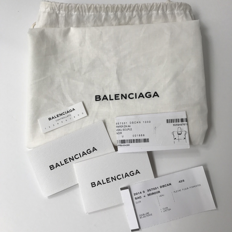 |
| Dust bags |
 |
| Boxes with filling and shoe bags |
 |
| Alternative packaging |
 |
Luxury comes from the colour contrast - any fashion person in the know would know that wasn't a regular shopper, further engaging in secrecy within the general market and acting as a cult brand
|
it is very important to pay attention to Branding and packaging
ReplyDelete