


Mint & Berry
The Berlin based label have opted for a sleek and fluid typeface, complemented by crisp photography to complement the garments. The garments themselves combine contemporary Scandinavian style with vintage touches, so the subtle retro feel to the typeface and colour palette makes the whole thing feel effortlessly, coherently stylish.


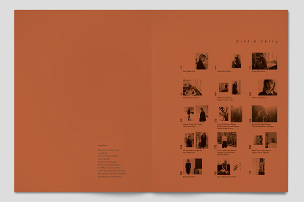
The use of simple halftones acts as a key to the images, helping the audience get a better understanding of the look book sequence.

No comments:
Post a Comment