 |
| Immediate icons which can be found on Google Search |

Landing Page
Minimal colour ways reflect as an ambiguity of visual communications. This may relate to the title 'noun', stemming from literary connotations and the English language. This itself has historical connotations of heritage and prestige highlighted by the clean modernist aesthetic and removal of photography, incorporating quintessentially 'graphic' components, moving the realism to the screen. It is almost like a photograph would seem out of place in this visual land created by The Noun Project, as this mode of communication ultimately redundant for this type of website.

Having the drop down menu is useful to suggest tags of things to search, related to the letters imputed. This highlights if what the user wants to search is already there, (meaning there's work available under that tag), and provides suggestions of alternate things to tag based on that predefined letter selection. This takes the user to a new page shown below.
The immediate response of no formal heading does spark an element of confusion to what the page is at a first glance, yet when investigating it is clear the searched subject, e.g.: collaboration, is highlighted indicating the viewer to where they are. This is located below the top thick row (below the search bar and icon row, emphasised by the use of black to draw attention to 9 collections viewed under different titles related to the title 'collaboration'. The overall appearance is clear and uncluttered, bringing the attention mostly to the icons and away from the typographic aids. The user is presented with the information that they can search for everything (as the landing page) from the top icon (presumably from every page), as well as that there's 364 icons under the tag 'collaboration', and 9 collections of icon sets. In this simple presentation, everything the user needs is there, with the top left logo acting as general menu, and top right icon acting as a personal menu.


Pop Ups
As the premise of the website is to provide icons in PNG and JPG format to professionals, possibly creatives within the industry, UI and marketing teams, even selling B2B, design and target audience is a consistently considered theme throughout the Noun Project website. Also using a layering system, the user is automatically placed in a position of control, allowing free-browsing of all icons without the restriction or immediate notion of logging in.
When clicking on an icon and pressing download, a simple 'Join to download' pop up acts as the second layer of engagement and decision making demanded from us within the interface. The change of colour ways and darker tonal qualities indicate a shift, away from the previous light aesthetic the user has got use to. Furthermore, by no immediate 'continue without joining/logging in', the user has to contribute more of their personal information in order to achieve the download of that icon.
By a clear colour being attached to the three options (green for email, dark blue for Facebook, and pale grey for pre-existing members), a natural organic tone aids the organisation of information, letting users who commonly use this process identify the action with the colour in future to act as a visual shortcut. The reduction of opacity with the top black layer indicates to the viewer which page they were previously on, so not taking them away from the page they have come to be on, or loosing their place if that page happens to be 24 pages deep of icons. A darker boarding box has been used again, highlighting the important information and drawing a barrier between the information from the previous page (icons), and the new information currently being presented to the user. This is acting as another thin visual barrier in between these 'layers', bringing attention to the information rather than less relevant features.
 |
This second pop-up is again a very simple procedure, only needing to tap the 'Continue as Jen' icon to continue, all being that information is correct.

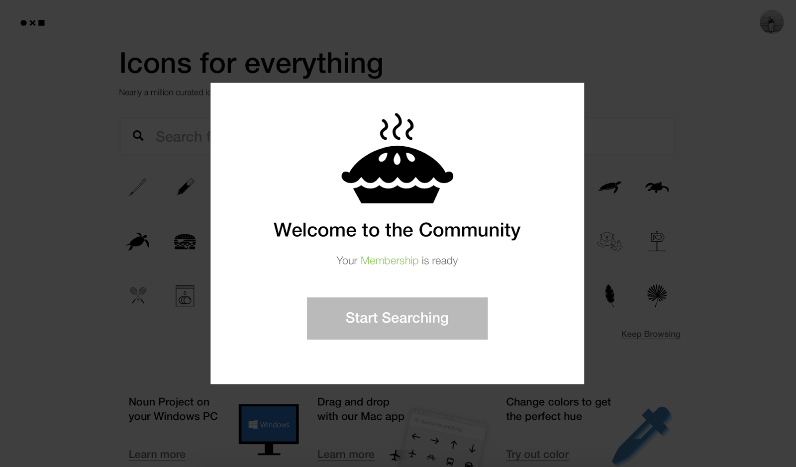
Returning to the Noun Project website, an introduction to the black and white (with predominantly light) interface style recalling the previous aesthetic which I was introduced to when first entering the website. The cheery pop up is just enough to convey a welcoming quality, leading to projected feelings of happiness and acceptance. Psychologists and graphic theorists state how we long to identify with a group (or a community of some kind), so the simple use of words 'Welcome to the Community' again acts as a positively engaging factor, appealing to deeper human desires.
Side bars
Roll over features to allow maximum visuals and un-cluttered design layout. No need to show all of the subheadings at once, so by having two icons breaking the information into two sectors, this can be translated virtually down the side of each screen, via a role over. This interactive element is an aspect I want to include in my own solution, allowing maximum attention to be placed on the information rather than website features. The solution (much like Noun Project) is acting as a silent tool to facilitate additional practice, so by observing The Noun Project the necessity of an invisibility to design style (especially when considering key features like the menu) is important when considering effectiveness and UX.


No comments:
Post a Comment