Creating a symbol
As my primary target audience and area to solve is Leeds, I researched more into the history of the city (following from SB1), looking if any aspects of Leeds could go towards influencing the design.
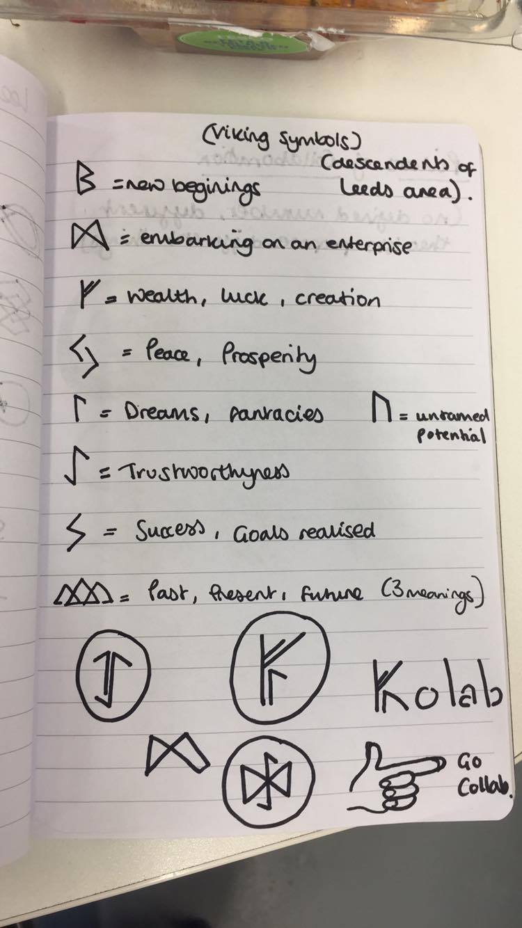
Symbols & Runes (Viking & Nose)


After getting feedback from peers, the use of hand gestures was preferred as a way to introduce humour, as well as a symbolic meaning.
Looking at Hand Gestures
International hand symbols- when greeting aliens, do the palm up one (no 3.) is apparently the friendliest symbol.
Emoji hand symbols- more modern and familiar with the target audience. Going towards becoming an international language yet still keeps their own connotations. Peace sign suggests peace and harmony within collaborations, as well as chilling out and taking a step back from the project to be creative individuals. The fist up one is suppose to be a knocking door, however it looks kind of like a symbol of power- however as it has no relevance towards collaboration I didn't look at is as an important aspect of development. The international symbol for peace also looks quite like a stop/halt signal, which in the context of collaborations and facilitating a stress-free collaborative platform, it is essential tone of voice is quite light and friendly, as well as culturally relevant with no negative ethical connotations (e.g.: no underlying suggestions of race war with the closed fist emoji), as this could negatively effect the brand and put off users from engaging.


 |
| Using hand gestures to create a logotype- after seeking feedback the target audience didn't like this as they felt it was too unprofessional. The intention was lots of different people coming together to form the word, acting collaboratively in the process. This illustrative outcome is too literal for the target audience, so something with more ambiguity consistent throughout the branding may be more appropriate. |
 |
| Possible Sticker (Range) designs |
As appose to just having a symbol representing the brand, the inclusion of a holistic logo or accompanying logotype is an efficient way of communicating the brand to those who do not have previous knowledge of the symbol, possibly broadening interaction from web users.
Experimenting with typefaces to suggest different things about the Collab brand. The introduction of the full stop into some designs is to create an immediate end. A short, snappy, refined word, described as "self explanative" by many peers in informal discussions.
I experimented with kerning, stroke and manipulated typefaces with the two names- 'The Space', another option, suggesting a space to facilitate learning and collaboration. As the small nature of a symbol would work better when considering product/range/distribution, so by fitting into a circular composition for instance, a transferability would be more easily visible throughout promotion.

After completing a range of brand possibilities and alternative designs, I reached a bump in the road and felt conducting a crit on what I have explored so far would be effective at giving more of a direction.
I printed off what I have done so far to gain feedback in a more tactile way, annotating logo designs and highlighting features of designs people found beneficial/not so beneficial, without constantly jumping back to the screen.
Experimenting with custom typography, breaking the rule of everything sitting on the baseline- also being influenced by two different typefaces, Futura Medium and Helvetica Neue Medium, fusing together in a collaborative process (with the manipulation on Adobe Illustrator in the production aspect).

Branding Feedback (Crit of 5 people)
- ‘The Space’ name is engaging, suggests a space to do work/to be creative/to meet etc…
- ‘Space’ name suggests a light tone, very airy and lots of room to breath- removing the stress from collaboration
- Colab really easy to understand- super short and easy
- Don’t need to explain colab (especially when just immediate LCA distribution)
- Adapt 2 tone design with an alternative typeface- looks too childlike as it is (looking back I should have asked WHY to this question, engaging the focus group in a more rigorous and analytical discussion- aspect of management I want to focus on in more development feedback).
- The necessity of a calming tone of voice is essential- nothing shouty or loud
- Think collaboration (and Collab name) suggests more art and design, especially between courses in places like Art School where it will be distributed
- Lots of different things coming together to form something (individuals fragments to form a symbol)
- Collab repeated continuously to suggest multiple people coming together but could be overwhelming aesthetically
- ‘The Space’ sounds established and professional
- Tight kerning is effective, possibly adapt the logotype of Helvetica neue bold- suggests trust and still looks established/professional
- Grouping of words to inform the overall identity (e.g.: Collab Me, Collab You, Collab Together).
- If using a full stop to emphasise the short/snappiness of the word, then the full stop is not needed
- Circular dot over Square dot, but if in a circle- doesn’t need full stop
- Look into connecting the letters up, creating a link between letterforms like you would with people
- Logotype with the variety of strokes (similar to The Public Theatre identity) initially doesn’t work at all as it is not aesthetically pleasing (which is a downfall of this design), yet when looking at it more it totally works and the formal elements/stroke adaptation could then become a transferable feature within additional branding/product ranges/advertising
- Legibility issues with the Jon thought L’s were I’s- legibility issues
- Get rid of dot- throws off the whole symmetry- especially within a circle composition
- The idea of using different fonts is an effective but subtle way of suggesting collaboration- possibly keep the lettering all the same size (no need to be different sizes for some of the designs)
- Handwritten style almost suggests collaboration
- Animate flicking through GIF hand symbols which reflect collaboration
- The introduction of the face with the base-line alignment sums it up- wink not too child like- adult with tinder style cheekiness.
- Could have 1 L or 2 L's- many companies often shorten or alter the lettering of their brand
- Humour and playfulness within the brand definitely appeals to the target audience, even only suggestively

Turning this idea of a winking face, into a GIF of a winking face. This could be used as part of digital campaigns, as well as a possible over over feature on the website. I produced this GIF in photoshop, and realised that animation is something I really need to work on. This is a challenge due to the digital solution this brief provides, but a good opportunity for me to consider how aspects of UX work technically.


ICONS & SYMBOLS Feedback (5 person Crit)
- Symbols how people interact with others work
- PREFER HANDS TO RUNES MASSIVELY
- Outlines rather than filled- more like line drawings
- Hands in drawn style for icons
- Back/Next buttons not hand rendered, keep everything sleek and professional (as the expandable range of the audience is broader than just art school)
- Making the icons flash/alter tone when you hover over them
- Use the symbols to interact with work on a subtle basis
- Flag content to save for later, rather than ‘like’ it
- No like button means you’d have to message the individual to show praise, which some may do but some may not be confident enough to do- the tone of voice around communication needs to be really freeing and open (key feedback)
- Black circle with white outlines for the hand icons, keep computer icons simple and legible
- Hand rendered obscure style is artistic and representing collaboration
- Effective and clear use of icons within the interface, clean, proper and consistent
- UX Icons for legibility function needs to be legible primarily, no fancy illustrations, just icon.
The crit gave me the idea to not roll out a full ‘like/love/appreciate’ system like the other social platforms do, alternatively go against the grain to keep it to the purpose. The only tools of engaging with work will be a message function, as well as a flag/save function. This save function could even be capped to a certain limit per day to avoid it turning into another Instagram/Behance, providing users with instant gratification rather than solid networks. By limiting the ‘like’ aspect of the website will limit the growth of the social platform, just using it to procrastinate and feel like they’re doing work, rather than actually doing it and properly engaging with the website. When I proposed this to the group they were in full support, thinking that would solve the problem of procrastinating online ‘in the name of work’, which is an underlying aspect of what the target audience do.
____________
idea: Flicking through GIFS of different hand symbols relating to collaboration and community- Hover over comes up COLAB, when you click it you’re going to a collaboration (possibly launches pre-generated search page, if so need to reconsider the menu as this was also going to be a scroll over)
No comments:
Post a Comment