In conjunction with the web platform, the mobile application will feature alerts set by the user, calendars and access to the work space. This will give them all the tools they need to be creative collaborators on the go- all they nee is the app *wink*. The tone of voice is fluid throughout, with animatic GIF features possibly featuring as aspects of this platform too. The neccesity for an app is vital as feedback states that receiving alerts on the go, or even quick viewing creative cloud flies on the go would be beneficial. As I do not have a lot of time for this brief, I am focusing my attention less on the App and more on the website, as feedback also concluded that that was more important. Designing the content for digital use is really beneficial as I get to spend more time on Adobe XD, which is a platform I find really simple and functional to use. The ability to prototype an app is a possibility, and with that create a promotional video to raise awareness of the website.
Wireframes
As the app is something which needs much more R&D I have outlined a few wireframes for the landing page, logged in landing page, and search feature. To keep images at a high priority the use of text is minimal, with icons and pictures doing the talking.


Developing an App Icon
 |
| Grid system for accuracy |


 |
| Possible bottom menu |
Initial landing page
Quite bland in the formal qualities and so may not be as engaged with, with the target audience. The idea with this was for the two images to transition together somehow, either with the App opening and creating a colliding together motion from each side of the screen, giving an engaging animatic; or that being the instant swipe function previously mentioned when mentioning the Tinder interface. By just sliding on the picture you can browse creatives at random (in your area if location services are turned on). However, this could become annoying to touch, especially if you're trying to tap on something whilst moving and accidentally swipe and click on someone profile. This annoyance would hinder the experience, so not being as appropriate for the purpose of removing aspects of collaborative frustration.

Landing Page
Bright vivid images from collaborators who have shared on the website. These images will keep changing in a side sweep animatic motion, softly and casually to show off as many great pieces as possible. If you tap and press on the image, the creators name and profile will appear as so to give them full credit. This is a more harmonious composition as everything is segmented and clearly allocated on the page. I altered the visual to a 35mm fashion image, shot for Level 6 Priya Palmer. The use of film images on a digital platform highlights the possibility technology can aid society for communicating messages just as it has done in the past through analogue processes. This in turn shows a more diverse side to LCA, especially due to the styling and light leak, yet will again be on a swiping feature so will constantly change.

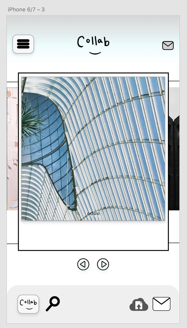
Pre-Generated Search Function
Developments in layout and positioning of information. Keeping the emphasis on the image by maximising screen size is essential , as well as giving the user accessibility to every page from where they are. The menu acts as a drop down feature, giving the viewer a familiar App presentation style.
When speaking to peers for feedback, it was clear incorporating the bottom bar was not needed with the drop down menu, so I tried to push the development in a way where information wasn't overly repeated to clutter the design. By having the bottom icon bar on this feature the usability may be compromised. As this feature works by a swiping motion, much like Tinder's user interface, it is essential mishaps do not occur where a user means to do one thing yet accidentally does another, and so unengaged the audience. By having a clean open bar at the bottom of the screen with only minimal text which vanishes after time, so no mishaps can occur.


Experimenting with colour ways for the app was difficult with just a monochrome colour palette and feedback stating 'keeping it light' would be effective. After looking into what colour ways work best for showing off images, it is clear that white is the classic for a reason, seconded to black. Blue is the worlds favourite colour, as well as the most commonly used on the internet. The hexadecimal code used here is #CAEFF2, a mixture of blue and turquoise to create a calming aesthetic.
App release using icons as a fluid concept throughout product/ range/distribution. The pricing is FREE as this is a not for profit application, just a tool to benefit society in a positive way. The ethical benefits of helping the community are where the most pride can be found because change is visible, so if this actually worked then hopefully the problem will be solved.

No comments:
Post a Comment