Thursday 18 May 2017

OUGD505: End of Moduel Evaluation

OUGD505 has been a really enjoyable moduel yet I do not feel like i have fufilled my potential at all. Considering the first brief of the moduel- the David Bowie print, i did not create a design to the standard I would have liked, or pushed the colour ways to a three colour screen print like planned due to time restrictions. Time management is something this brief has highlighted to me, as the tight turn arounds this brief has demanded has been a big challenge for me.I am not fully happy with the final deliverables for either brief as not enough time was spent refining the details and presenting the solutions- something I  planned to do was create a research book outlining information, but again did not have time. However, for studio brief 02 especially I conducting lots of primary research my solution has been informed vastly by the target audience, yet this principle should have also been taken the design aspect, getting more feedback and creating a wider range of finished visuals. The introduction of Product/ Range/Distribution I feel has been communicated effectively as an encompassing identity runs holistically throughout Collab. By going in depth into primary research and engaging heavily in constant feedback with the target audience I feel the resolutions are appropriate to solve the given solution, as well as having the scope to benefit Leeds College of Art but also the wider creative industries. Despite the end of module being now, I feel there is genuine possibility within this idea so may develop it further and take it to the Business Summer School and pitch it as a socially beneficial business plan, something I would have done within this module yet did not have the time. The distribution of the advertising will be mainly around LCA, introducing hashtags such as #GoCollab to again highlight the real intention- getting more people to collaborate and communicating. If I had more time on this brief I would have animated pop ups, scroll overs and chat windows, aiding this aspect of communication and positive engagement with the interface, however I feel what I have created so far does solve the problem, yet could have been pushed further, especially in the design sense, to possibly consider the space more and be even more functional than it aleready is. In conclusion, I am moderatley satisfied with this brief, I only wish I had longer to complete the full range to the best of my ability.

In conclusion,I have not fulfilled my potential for OUGD505 and due to other time management issues did not have enough time to write up half of the primary research and feedback i have received (after accidentally deleting the blog post). In the future I will try to focus more on one task at a time, i'm pretty sure I have developed ADHD so focusing on one task is really hard at the minuit hense the poor resolution of deliverables

OUGD505: Initial Branding in Situ

Going around Leeds College of Art seeing how the current range looks in setting. The use of black as a primary colour identifier suggests a timeless ambiguity, as well as feedback stating it looked more professional and trustworthy with the clean branding. Introducing hand icons within the design allowed me to be playful and see how this could integrate within public space. The image on the left below shows how the viewer could go in either direction, and find a creative of some kind to collaborate with. The overwhelming darkness from a far stands out as bold and serious, yet when introducing the playful logo and icons then the meaning is transformed again (recapping on the levels aspect of UX in some way).


By recapping on my goal of increasing collaboration, tapping into the pre known channels to promote the website is essential, possibly creating a hashtag to go on Instagram. When wandering around uni observing what promotions caught peoples eyes, I noticed a hidden corner within the Student Union which contained multicoloured balloons and silver shimmery backdrops. It stroke me as fascinating that this spontaneously creative space had popped up within LCA, and is quirky and creative itself. By utilising the space and functionality of Leeds College of Art, we can engage the target audience more, as they also engage with LCA on an often daily basis. This emphasises the commonalities, encouraging brining people together. 


A social media hashtag (mainly for Instagram) could feature #CollabMe, with a student looking for a collaborator, holding a slip of paper saying who'm they're looking for. This would create a multi-platform distribution for the platform, promoting the website. By giving the control to the user of where to post it, with the association of Collab.com, the breadth of interaction is maximised and hopefully increased searches.


The 'Seeking a' A5 cards would be printed and placed near the area in uni. To save on cost for Precision Printing and white ink, these can be screen printed on black 220 gsm card, easily purchased for relatively inexpensive. However, by having black stock regular pens will not show up or work on this surface, meaning a pot of branded Collab white felt pens would come with black card templates. This could all be distributed to a university in a CollabPack (tote, cards, white pens, stickers, posters).

I posted them around uni to the primary target audience- this could be extended to posters around highly populated student area's, such as Hyde Park (or the cubes we see around Leeds); alternatively places where creatives are situated. Places like Belgrave Hall & Canteen, Colours May Vary, Village Bookstore all have a wide variety of creative clientele, ranging in specialisms with a common interest in design- and sharing design due to the situation of appraisal within some of the shop settings.


Distributing through different departments, as well as sticker mock ups easily scattered in smaller places. In many cases the tone of voice of Collab with the hand icons is much lighter than some of the others, with the 'SWAP/SHOP' initially grabbing my attention within this image, and then over towards the telescope lady in the bottom right and over to Collab. The introduction of the hands comes off playful and engaging, almost acknowledging the work around it in a suggestive positive feature, highlighting people right there you could potentially collaborate with.


When observing how people interact with the spaces around uni, it is clear that Plug Sockets are something of key importance and engagement- the same with most public spaces today. By highlighting this as a feature of significance we can tactically place branding to target the audience further- often if they need a charger, they are charging a computer or phone, suggesting professional or student of some kind. This information is also useful to keep in mind if pushing the brief further, expanding as a larger network in the future.

 Looking at the spaces and seeing how the range/distribution are intertwined is really interesting to see, as it is clear for some aspects I could go back and redesign to possibly be brighter and look more 'creative'. However, the overall aesthetic of the brand is currently playfully serious, something which is perfectly in keeping with the intended tone of voice.

OUGD505: Developing the Website

Icons


Scalable at different sizes for different purposes across the platforms


Creating a standardised set of icons to use across all platforms (web/app), and all page sites. Feedback has identified the need for clear visible icons, yet creativity to be introduced through the use of branding symbols. 


Experimenting with a symbol as the logo-head of the website- this could also be the GIF filching through the icons and flashing 'COLLAB' at the end.

Drop down menu wireframe features. The categories are broken down into three main areas, Search & Connect, WorkSpace and My Profile. They all do what they say on the tin, allowing the user to search for creatives easily and accsibily, broken down into groups for reducing the number of clicks it takes to access key information. A hover over feature will also add interactive elements for the viewer, with the discipline/option possibly turning a different colour or brightening in opacity when rolled over. 


Use of language to create a spread of language (You/Me/Us). Much more personal than other wordings. The ability of a really simple log in process may encourage users to sign up, as well as by connecting a social media account we will be able to connect the LCA collaborations page, where an algorithm can take appropriate information for other aspects of the website.


Search feature pop up as an advanced search to find creatives near you. Would be hard to incorporate a tinder style interface online effectively, so experimenting with a pop up window is an alternative. The current style of the above image is too resemebellant of Pinterest, where work is not appreciated properly and just washed away in a sea of thousands.

To counteract this, I considered just having two images on the search screen/pop up backgrounds, drawing attention to the artwork's detail and showcasing the creative in a more influential way. By giving a full feature to alternating artworks than rather just a small window, shows the pride the platform has in its users work 


Experimenting with tags as a quicker way of quickly finding creatives- can narrow the search and find somebody more specific, perfect fort the upcoming project need and collaborative requirement. It was identified in feedback that people often find it hard to find the right person for the job, so by refining the search criteria would minimise this risk of the person being wrong for the job.


Presenting creatives using a consistent grid system, allowing a scroll over feature where the creators Studio name/ @username appears, as well as their discipline. This will minimise clicks again, however the users will be encouraged to click on the boxes and explore the work more before agreeing to work with anybody. I have chosen to visually represent Animation, as this is a subject where the breadth of work is colossal. The simple colour palette highlights the work and brings the attention to the individual styles and purposes on offer. The tags are a useful feature derived from Twitter and Instagram which will feature throughout the whole interface.


Wednesday 17 May 2017

OUGD505: Experiment with Colour Ways

Experimenting with a light vs Dark interface to see which engages the audience the most


OUGD505: Designing the Landing Page


Encouraging user to scroll down the page and interact further with the website. Large oversized text adds a graphic quality filling the space but being quite oppressive and demanding with its presence. The reduced black box with a slight blur separates the information away from the images behind, drawing more information to the typography. Helvetica has been adapted with tighter kerning, in bold, also giving current references to the LCA branding for the Extra-Ordinary exhibition.  Furthermore, feedback indicated that the use of Helvetica in this style was favoured over others, so I will listen to the target audience and maintain this aesthetic.

OUGD505: Final Branding

Final name: COLLAB

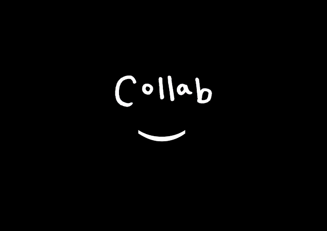
Short and snappy- straight to the point. The selection was made from the feedback I received about the branding, considering how the typography is displayed and not giving up on the introduction of the bracket to suggest the face. Moving away from a digitally rendered type logo to a hand rendered solution. The use of this medium highlights Collab are a platform intended at more creatives, studying art and design rated courses. The introduction of the bracket suggests a smiling face yet again, but in a much less subtle way, allowing a universal identity being built on this fact.

The target audience also said that the name collab needs no additional explanation in the art school environment, and other distribution methods, meaning the use of more ambiguous symbols to identify with collab is possible. 

The colour palette is predominelty black and white with aspect of transparency letting the colour of the image come through sections. The rustic orange on the drop down menu's is (hexidecimal #C2895C). By keeping it black and white the removal of genders or subjectivity in design is present. The hand rendered logotype also perpetuates a humanistic quality, unlike Instagram/Facebook/The Dots which are all quite clean and corporate.


Listening to feedback I wanted to play on the use of symbols and integrate these within all aspects of the branding, including stickers, uni packs, tote bags etc.


Developing GIFS to illustrate the idea and be distributed via social media, illustrating the key icons used for the Collab identity. Each symbol reflects collaboration in some way, the thumbs up suggest 'good job' or even 'ey up', the peace symbol reflects a chilled out working attitude, the okay symbol has been reappropriated in popular culture to have cheeky emoji connotations, reflecting a more millennial audience.


Transferable icons for cover photo's on Facebook or posts on Instagram.