- Stay away from the black and white cut outs as they look quite negative, rather than suggesting positive things
- Can be a playful piece about expression- not restricted to political statement or protest
- Hand rendered collage technique is appropriate for this
- Consider colour and how it will be printed
Friday, 31 March 2017
OUGD503: Art From Non Art 02
Feedback
Thursday, 30 March 2017
OUGD503: Art From Non Art Developments 02
Feedback
- Stay away from the black and white cut outs as they look quite negative, rather than suggesting positive things
- Can be a playful piece about expression- not restricted to political statement or protest
- Hand rendered collage technique is appropriate for this
- Aspects of humour work well with typography- hand rendered type would be a good idea to explore
OUGD503: Art From None Art Competition 03
After creating some pulmonary compositions using collage, I directed my attention on refining three ideas. The benefit of this brief is that it is not too heavy or concept driven, especially with the medium of collage being very expressive and playful, I felt it appropriate to juxtapose this or question the element of play within design, further linking to the brief 'art from none art'. Using this small brief as an opportunity to experiment with creativity, I dived in head first and got to work on some proposed ideas highlighting the importance of designers doing work for them.
 |
| 'Royal Lady'. Composed of aspects from Vogue magazines luxury advertisements, I wanted to expose how abstract and out of place images can look when not in their appropriate setting (much like the Royals, leading to the title). I deconstructed a Chanel advert, appropriating aspects of furniture and fashion with perspective qualities and compositional techniques. The use of a crisp white background fits to the conventions of collage, so I thought this design may fit with the overall theme of the exhibition more, so utilised the negative space as a tool to engage the viewer. |

Incorporating more of a newspaper aesthetic deriving images from the UK's most common newspapers. As femininity ad the role of women is something of interest to me, I wanted to add humour and mix the collage styles together, creating a narrative within the piece. As this is for exhibition purposes, I want to increase audience participation in some of the busier designs, hoping the audience will then interrogate the image more when in the exhibition setting.
 |
| 'Hold your own fucking hand' |
When considering the fundamentals of graphic design, and the role of graphic design within a collage/art from none art style exhibition, I was immediately drawn to the combination of type and images to convey a message. Often in graphic design briefs the viewpoint of the artists is rarely considered, and I especially try to avoid projecting a certain style if this is not justified for the brief'. However, the combination of text and pictures in a creative way places collage and graphic design on a relatively latteral field, so i felt it only necessary to combine the two. The background typography is a hand rendered monologue questioning what Graphic Design is, overlayed with a fashion image as this is my personal grey area, so the idea I wanted to explore. There seems to be this silent line to catergorise what is graphic design and what is not, so I wanted to explore this by combining the two to reveal the hidden language, discussing how you can design nice things without having a clue how they work, and that all graphic design is is having a confidence in your idea/ability. With this in mind, the title stems from the quotation written inside the subject.
 |
| Submission email to Dan at Goat Collective 2 days prior to the deadline |
Wednesday, 29 March 2017
OUGD503: Art From Non Art Competition 01


The brief is asking for 'art from non art', meaning incorporating additional pieces to construct something new. There is no restriction to subject content or aestetic, so this brief is a perfect opportunity to expore my creative freedom, with the possibility of being fatured in an exhibition! As Responsive is all about getting our work out their and connecting with the wider industry, I felt this opportunity was essential. I intend to get featured and may even cater my design styles to to increase chances of being selected.
Visual inspiration and research


Thursday, 23 March 2017
OUGD503: Greenalls Submission + Evaluation


I need to learn to make multiple different copies and not be such a stupid idiot in the future with regards to everything I do- every single part of this brief has been done at least 3 times.. including the blogging and analysis.. I even managed to delete a whole blog post which which broke down all of my ideas, yet due to time restrictions I didn't have time to write it up into more detail. This brief has been at the front of my mind since October. I have visited different Gin distilleries in London, Leeds, Liverpool and Manchester for contextual research and conducted interviews with the people working there (which has also been lost due to corrupt hard drive).
I am not satisfied with the outcome of this brief, nor do I feel I have achieved my intentions of actually doing work which will change something. I have really really tried with this brief, yet due to the way my head is at the minuet every time I try to add to it, I either loose the work due to stupidity or delete it accidentally. If I could do this brief again I would take things much slower and more rationally, seeking more feedback to direct my ideas and what deliverables they would produce. I would also be more careful when saving/storing work hence making these mistakes.
OUGD503: Greenalls Photoshoot(s) (9)
Re-capping from the test shoot, I decided to hire out the photography studio, echoing the decision decisions and style of M&S photography. The deep, dark eerie tones I wanted to create weren't too difficult to recreate using tactical lighting and the right ISO. Unfortunately, straight after the shoot I leant my friend my hard drive (where the images were kept), who then dropped and broke it- resulting in all of the images being erased so no proof of this shoot. This experience has taught me to never lend people things unless I have another back up, and to back up my work straight away to prevent such incidents happening in the future.
As it was now impossible to get a studio slot before the deadline, I altered my strategy and reshot on a location where natural light was plentiful, featuring a big kitchen window looking out onto a state of social realism. I felt this backdrop (if captured) would suggest the Warrington streets where the brand originally comes from, whilst having props suggesting a family home.
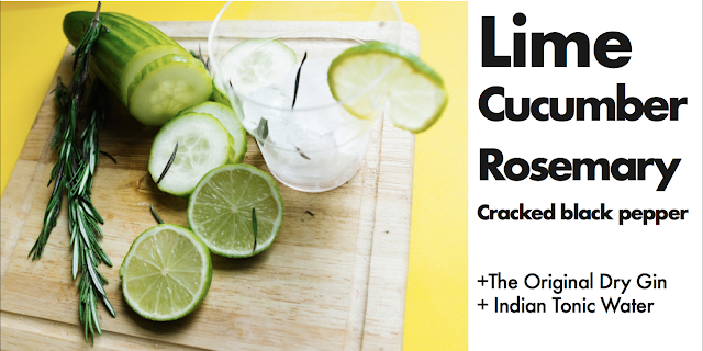
The images came out really well, full of colour and vitality, positioning the iconography towards a more vibrant audience. However, the image quality (compositionally and resolution) is not as good as the previous studio shots. These images will inform social media collateral (and example posters), possibly a cocktail book (bottle knecktag) continuing down the cocktail theme exploring the breadth of the brief.


I edited images going along on Adobe Lightroom, selecting the ones to turn into posters along the way. I wanted to increase the vivid liveliness within the images, making the products seem more desirable in the way Greenalls does, but also incorporating aspects of their colour palette with varying tonal qualities. This gives a slight flexibility away from the deep forrest green, introducing more summertime connotations.
As it was now impossible to get a studio slot before the deadline, I altered my strategy and reshot on a location where natural light was plentiful, featuring a big kitchen window looking out onto a state of social realism. I felt this backdrop (if captured) would suggest the Warrington streets where the brand originally comes from, whilst having props suggesting a family home.
The images came out really well, full of colour and vitality, positioning the iconography towards a more vibrant audience. However, the image quality (compositionally and resolution) is not as good as the previous studio shots. These images will inform social media collateral (and example posters), possibly a cocktail book (bottle knecktag) continuing down the cocktail theme exploring the breadth of the brief.


I edited images going along on Adobe Lightroom, selecting the ones to turn into posters along the way. I wanted to increase the vivid liveliness within the images, making the products seem more desirable in the way Greenalls does, but also incorporating aspects of their colour palette with varying tonal qualities. This gives a slight flexibility away from the deep forrest green, introducing more summertime connotations.
OUGD503: Greenhalls Visual Developments (10)
Using the images from the photoshoot, I pushed the development of a posters/social media series to put the World Gin Day identity on. As the identity developments at this point are hinged off Greenall's use of Futura and Bodoni 72, I kept these typefaces consistent throughout all communication, creating a link between Greenalls actual identity and the synthesis with World Gin Day. Furthermore, the two commonalities of typeface and colour ways identify World Gin Day with Greenall's without the need of an official logo (as yet) for the first stage of developments.
 |
| Effective use of vibrancy- the yellow and green perpetuate a refreshing pallett, linking to the refreshing nature of the drinks. Futura Medium is the predominant typeface, the tightened kerning unifies the composition, creating a solidify and difference between text and image. By keeping the 'Keep It Classic' |


Flavour cards: 3 Developed
3 Flavour pairs to instantly spice up a G&T- Very little effort required and all go perfectly with Greenalls. This can be expanded to
- Orange + Lemon
- Mango + Mint
- Mint + Blackberry
- Blackberry and elderflower.. etc etc


Wednesday, 22 March 2017
OUGD503: Greenalls developments (12)


Implementing the logo onto small posters/ taste cards, relating to the theme of cocktails and summertime flavours


OUGD503: eCocktail book (10.1)
Possible eCocktail book/ miniature print outs for bottlenecks featuring new special Greenalls cocktails.
The proposed design style takes a modernist approach and incorporates the main brand type choices. The publication if printed would only be 2x2", so convenient for pocket carrying. The main colour scheme has been carried through, keeping to the Greenalls identity.


It would feature more recipes and suggestions for the audience to try at home with their new Greenalls purchase.
OUGD503: Greenalls Development (7.1)
Considering the target market Greenalls is wanting to expand to- a quick fix in the form of an advertisement isn't really tackling the problem. Greenalls are huge figures at Race events, so why not expand to festivals? These do not have to be strictly music, millennial interests vary, and considering people mainly drink Gin because of associations of their parents drinking it, country fairs and events such as Food and Drink festivals would be a good place for Greenhalls to expand to. This could reach even further to a 'Greenalls Tour', taking over spaces in up and coming cities in the summertime when population is at high velocity.
Competitors such as Pimms are a regular feature at trade show events and food festivals, the Leeds International Food Festival last year had one Pimms tent, with queues always around the block as they dominated the market in refreshing summer drinks at that particular geographic location. Greenhalls has the opportunity to do the same and indulge current gin fans on their travels, and hopefully expand their supporters. Receiving a positive experience will lead to a positive brand recognition being made. This should hopefully pursuade future decisions when purchasing a Gin or recommending a drink to a friend (especially if Greenalls Cocktails were served). The appeal even spread to non-Pimms regulars, and I have witnessed first hand consumers. In addition, Jagermeister have branched into festivals, two big ones they dominate are Reading and Leeds.
As World Gin day is an event coming up in June, if Greenhalls want to have brand recognition with this event it is essential they have a first mover position- identifying a public holiday with the original gin, Greenalls.
- Tent stand redesign
To accompany the festive spirit of the day, I considered the things which really draws in society today. The concept of a 'deal' will automatically engage the aucience- especially in an environment where Greenalls do not have Pimms' luxury of monopolising the space. By giving the consumer good value for money it instils a trust and confidence between the brand and consumer, leading to further positive brand recognition.
Looking back at research, Heineken created a wristband so you didn't need to keep money on you, in exchange for Pint tokens easily removed. Only at some current UK festivals can you purchase a wristband (or pre-purchase lots of drinks), without receiving them all at once. The convenience of this to the audience and user would be that they could simply set a drinking limit for themselves (or guess from experience), how much they will drink that day; and can purchase drinks tokens that are secure to them to avoid loosing like possible wallet).
- Wristband experiments


Competitors such as Pimms are a regular feature at trade show events and food festivals, the Leeds International Food Festival last year had one Pimms tent, with queues always around the block as they dominated the market in refreshing summer drinks at that particular geographic location. Greenhalls has the opportunity to do the same and indulge current gin fans on their travels, and hopefully expand their supporters. Receiving a positive experience will lead to a positive brand recognition being made. This should hopefully pursuade future decisions when purchasing a Gin or recommending a drink to a friend (especially if Greenalls Cocktails were served). The appeal even spread to non-Pimms regulars, and I have witnessed first hand consumers. In addition, Jagermeister have branched into festivals, two big ones they dominate are Reading and Leeds.
As World Gin day is an event coming up in June, if Greenhalls want to have brand recognition with this event it is essential they have a first mover position- identifying a public holiday with the original gin, Greenalls.
- This means some form of collateral needs to be created as an identity linking the two. This can take place in the form of social media collateral, as that is the primary mode of communication. I have followed the Greenalls accounts and there has been a notable increase in the amount of times their posting- and what copy they put with it. Greenalls are definitely trying to engage the audience, so if this brief is to fully comply with their brand guidelines and strategy- I need to do the same to inform the preposed outcome.
- Tent stand redesign
To accompany the festive spirit of the day, I considered the things which really draws in society today. The concept of a 'deal' will automatically engage the aucience- especially in an environment where Greenalls do not have Pimms' luxury of monopolising the space. By giving the consumer good value for money it instils a trust and confidence between the brand and consumer, leading to further positive brand recognition.
Looking back at research, Heineken created a wristband so you didn't need to keep money on you, in exchange for Pint tokens easily removed. Only at some current UK festivals can you purchase a wristband (or pre-purchase lots of drinks), without receiving them all at once. The convenience of this to the audience and user would be that they could simply set a drinking limit for themselves (or guess from experience), how much they will drink that day; and can purchase drinks tokens that are secure to them to avoid loosing like possible wallet).
- Wristband experiments


OUGD503: Branding + Identity Research (8)
Greenalls Brand Identity + Guidelines are not featured within the project pack, and their foundational design is not limited to the dark forrest green of the logo. To keep it Greenalls Futura needs to be a prominent feature, as well as an appropriate and relevant colour palette linking Greenalls to World Gin Day.
World Gin Day 2016 Logo- no current 2017 one as yet. The alignment of having world gin day perfectly aligned works well as a composition, yet the horrific use of multiple gin bottles for the interior overcomplicates and illigitimises the event. The green outer stroke references Gin bottle green (or in our case, Greenalls), yet this does not work coherently with some of the colours featured within the bottle photography. A bolder quality needs to be applied, suggesting British history mixed with contemporary culture.
|
As Branding isn't an area I have paid a considerable ammount of attention too int he past, this will be a good learning experience for me to utilise 'commercial' design, and experiment with creating logos and manipulating typography- as thats a big part to the freelancing I am expanding on over the year. I researched alternative identities for inspiration over the course of about two weeks, contantly checking Creative Review and Its Nice That for new identity features. The inference on design cannot be too rustic nor too modern, as these may reflect other Gin competitors rather than Greenalls (e.g.; victorian illustration style- people will think Hendricks).
Branding from Tutto Matto, Edinburgh based Pizzeria
A rustic, hand stamp typeface and compositional design has been created, echoing a traditionalism and un-refinary through the textures it creates when printing. The circular composition suggests an inclusive brand, fully coherent and working in harmony to suit the customers needs. A Hand rendered decorative illustration sits behind, breaching out from the circular composition, interesting the negative space to create a delicate curvature, allowing the logo to almost float on the page. The colour palette is very limited to green-white-black, with the contrast between dark green and black in places hard to distinguish, yet legibility is still present. The typography is a soft ended san-serif, with a slightly elongated x-height, suggesting an elegent approach and quality product.
The project can be broken down further, creating a range of circular/stamp inspired compositions for all the smaller subsections of things Tutto Matto offers- this could relate to Greenalls Original, Sloe, Wild Berry, or even the different individual cocktails in the future. The stamp effect and minimal compositions works well as it suggests instantaneity but traditionalism- hand rendered quality, just like the product (pizza).


Type & Illustration
Unknown project found on Pinterest, exploring typography and illustration to work in harmony. The simple compositions suggest a stripped back, clinical nature to the brand where ingredients is everything. A harmonious relationship is apparent between the clean style of photography, typography, and illustration. The thick stroke suggests a boldness within contemporary modern design, complemented with the adjacent colour block simplistic illustrative quality. (This could be interesting for Greenalls- experimenting with illustration for G&T/Cocktails, rather than photographing perhaps?)


BLA BAR Identity
Created by BVD Agency have created an simple, yet versatile and scalable design for a new concept store in Osaka, Japan, offering miscellaneous goods from Scandinavia. Blå Bär means 'blue berries', represented by the three dots in the Swedish letters Å and Ä. Letters and dots are used as a bold, clear graphic tool to possibly emphasize the great variety of high quality design items in the store, as well as relating to the Swedish herritidge. A playful, experimental layout creates an attitude, all with very few graphic elements. This simplicity with figures builds a clear and strong brand identity diverse enough to be altered to meet future opportunities and changes to the brand. Greenalls may be too much of a traditionalist company for something this Swiss-Moderne, yet the principles of symbols acting as signifiers, breaking down and simplifying letters/charecters, and minimal use of type are are not tactics to rule out- especially if offset with something very traditionalist (e.g.: Caslon or around botanical inspired drink)


Presenting Brand Guides/Proposals for submission


Branding from Tutto Matto, Edinburgh based Pizzeria
A rustic, hand stamp typeface and compositional design has been created, echoing a traditionalism and un-refinary through the textures it creates when printing. The circular composition suggests an inclusive brand, fully coherent and working in harmony to suit the customers needs. A Hand rendered decorative illustration sits behind, breaching out from the circular composition, interesting the negative space to create a delicate curvature, allowing the logo to almost float on the page. The colour palette is very limited to green-white-black, with the contrast between dark green and black in places hard to distinguish, yet legibility is still present. The typography is a soft ended san-serif, with a slightly elongated x-height, suggesting an elegent approach and quality product.
The project can be broken down further, creating a range of circular/stamp inspired compositions for all the smaller subsections of things Tutto Matto offers- this could relate to Greenalls Original, Sloe, Wild Berry, or even the different individual cocktails in the future. The stamp effect and minimal compositions works well as it suggests instantaneity but traditionalism- hand rendered quality, just like the product (pizza).


Type & Illustration
Unknown project found on Pinterest, exploring typography and illustration to work in harmony. The simple compositions suggest a stripped back, clinical nature to the brand where ingredients is everything. A harmonious relationship is apparent between the clean style of photography, typography, and illustration. The thick stroke suggests a boldness within contemporary modern design, complemented with the adjacent colour block simplistic illustrative quality. (This could be interesting for Greenalls- experimenting with illustration for G&T/Cocktails, rather than photographing perhaps?)


BLA BAR Identity
Created by BVD Agency have created an simple, yet versatile and scalable design for a new concept store in Osaka, Japan, offering miscellaneous goods from Scandinavia. Blå Bär means 'blue berries', represented by the three dots in the Swedish letters Å and Ä. Letters and dots are used as a bold, clear graphic tool to possibly emphasize the great variety of high quality design items in the store, as well as relating to the Swedish herritidge. A playful, experimental layout creates an attitude, all with very few graphic elements. This simplicity with figures builds a clear and strong brand identity diverse enough to be altered to meet future opportunities and changes to the brand. Greenalls may be too much of a traditionalist company for something this Swiss-Moderne, yet the principles of symbols acting as signifiers, breaking down and simplifying letters/charecters, and minimal use of type are are not tactics to rule out- especially if offset with something very traditionalist (e.g.: Caslon or around botanical inspired drink)

Presenting Brand Guides/Proposals for submission


Subscribe to:
Comments (Atom)