My initial response to the brief is to create a publication focusing on one spacific design principle. Despite this brief being more constricting than the large publication, the amount of topics covered this year provides me with more than enough information to look at one in detail. Despite my intentions to investigate one principle in detail, I want to keep the tone of the book very informal. There are many ways this can be possible, ideally a thin zine targeted at beginners, or refining the topic of discussion to a very specific area of design, possibly even a question that can be answered(?).
My aims are to produce a thin publication relating to modernist principles. I feel I naturally sway towards cluttered design, as graphic design at the moment has a strong Scandinavian inspiration in places I feel it is essential to prove to myself I can comply with the modernist principles, moving out of my comfort zone.
For the Design Principles module I chose to investigate CMYK and White Space for beginners.
I chose CMYK rather than standard Colour Theory because I find it fascinating how there is two different colour mixing methods for print and digital. Without this prior knowledge naturally design will not be fully fit for purpose, as well as the colour not being truly reflective of the designers intention and subsequently the piece coming out incorrect.
I want to showcase how the colours are created, the importance of using CMYK and showcase this using a correct balance of negative space, whilst exploring typesetting and type alignment in a modern way. I want this publication to have a higher end feel, due to the use of white space, despite only being a thin zine. I am currently unsure about binding methods, perfect bound would be my ideal outcome yet I am aware this is tricky to perfect. A simple staple or stitch may provide an equally modern theme.
Research //
The Sydney Opera House has incorporated a bizarre use of colour, engaging the viewer on a positively primal level due to the vivdity of the blue circle. I never would have thought of this colour combination and plan to look back at this when I am stuck for inspiration. The bold colour and shape
Initial Ideas //
Inspired by the double colour spreads of above...
Too boring and unengaging. Look at ways of incorporating tone or imagery to break up flat colour.
 |
| Clever but subtle use of Hef-Tone |
Looking at different ways to communicate colour //
After a visit to the library I explored Colour Image Scale, Designers Guide to Colour 1-3 and Pink by Hate Cantz to see how professional books on colour showcase their colours. It was interesting to see the variety of ways colour can be represented, even through a simple object or pattern.
Developed pages //
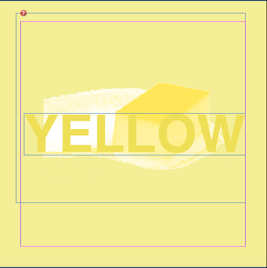
Double page spreads will look at White/Cyan/Magenta/Yellow and Key (black) in tern.
 |
Yellow shades suggesting pastels, vividity and sunshine, highlighted visually by a stylised image of butter. |
Double Pages //


No comments:
Post a Comment