


Changed this to remove No.18 and the black insert page. This gives a sleeker finish continuing from the same theme.


Mock up Prints //
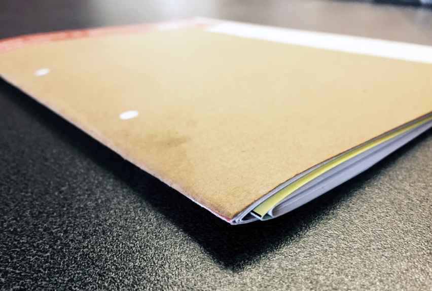
Still unbound and not 100% finished (still rough edges etc), I experimented with Matte 200gsm paper, printed with a Satin Finish ink. The paper quality is good and makes the publication considerably thicker, yet I would prefer it if there was a heavier grain on the stock, emphasising the tactability I want to acheive.


No comments:
Post a Comment