Friday 29 April 2016

OUGD406// Speaking From Experience 02

Initial digital mock ups //

Experimenting with typographic posters in a modernist design styles. After presenting my current idea's to a small critique group they told me to be "abstract and funky", as thats the best way to engage with the target audience of 1st year Art Students.


As first year does not have the stress of dissertations, there is a very strong relaxation in the air that 'first year doesn't count'. Despite this being true from a grading perspective, first year is a huge stepping stone onto 2nd year study and can have a negative impact if work standards are not met.

When asking peers about this idea they were in support of the chosen idea, yet conscious that this could come off negatively in some peoples eyes, especially if I was giving the impression that "first year doesn't count" entirely. Taking this on board, I feel by addressing a calming nature through the use of illustration and even advice, this would be more useful for the viewer. This could also be conducted through production methods, perhaps printing onto a pastel or textured stock.


Final outcomes //

Printed on G F Smith 'Softy', I wanted to incorporate the fun texture and advice in a calming manor. Incorporating the quote 'Stroke the furry wall' from hit film 'Get him to the greek', I feel this 
inter-conxtual link adds a humorous tone applicable for the target audience whilst the calming colours are popular within design trends at the minuet. People just arriving at art school are here because they have been influenced by design, generally the most popular design. In the hope of making a 'trendy' flyer, this may fulfil my personal intentions of it being stuck on bedroom walls and not just thrown away. Despite both quotations printed on 'Softy', I feel the most appropriate is the 'No Life, No Design' as it does not convey too much of a strong message that 'first year doesn't count'. The print finish cropped off the P from 'Pre-Book...', also making this outcome unfit for purpose. Composition is  something I was concerned about, not sticking to a flush left modernist approach may make the flyer more inviting and less like "advice", again copying to my intentions. Unfortunately not enough time was spent on this brief due to correlating deadlines and practical work, resulting in prioritising in the wrong places through time management. If I could re-do this brief I would stick with a A5/A4 flyer as I feel this is the most appropriate way to stay in someones environment, yet may extend the series to better advice or even exploring some of my initial ideas. Overall I am fairly happy with the outcome but feel it could have been a lot stronger if more attention could have been paid.


OUGD406// License to print money 04

Creating a letterpress chase is simple yet time consuming to get right. By introducing furniture and leading to hold the typeface/numbers in place, a chase is created (shown below), allowing consistent continuous letterpress prints. I experimented with the Adanna letterpress, using Adana printing inks relating to my previous colour scheme and deforestation. I found it really difficult to lock the chase in place due to the scale of the typeface and where the letters/number needed to be positioned in order to print effectively. As prints were so inconsistent when the chase was locked in, I created a mini template positioning my note on a larger piece of stock. By doing this it allowed accuracy through traditional print, alongside giving a larger surface area for the Adanna to hold onto providing more security. 


Problems arose throughout the letterpress process, the first with the 10 digits selected. I opted for Gill Sans 48pt for the number 10, providing a strong modernity through it's san-serif structure. I felt this contrasted well with Johanna, 18pt providing a softer serif traditionally, an aspect balancing out my brief nicely. Unfortunately, the first 1 0 in Gill Sans was cut off at the top, resulting in an unfinished ascetic when printed. To resolve this I had to disassemble the chase and re allign. This is definitely something I will look out for in the future when letter pressing.

First prints of Letterpress onto lino
 As I am intending to foil block, I purchased a tub of pure black ink in the hope that by applying the black by hand, a further fluidity would be created making each note personal. Unfortunately this did not work, I was unware that only specific inks are picked up by foil when placed under heat. As my bank notes are all printed on thin recycled stock I did not want to expose them to unnecessary heat, yet this is definitely something to bear in mind in the future.


Creating a messy edge at the side. I felt it best to divert from my digital mock up and do whatever seemed best when in the mindset of traditional printing. I feel the composition was still quite bland, even the jaggedness of this black lifted out qualities, yet is purely to balance out composition.


Foiling is something I have attempted before, yet was unaware only certain types of inks are compatible. I cut out 'Champagne' and 'Copper' foil, placed it face down and masked it in place over the black area. My intention was to create two sets of three, one with champagne foil and the other copper.


Final bank notes and Evaluation //


Due to many technical difficulties, my final print is no where near what I expected it to be. Through sheer negligence on my part I overlooked a huge part of the concept, forgetting to re-set the dates and  digit on each note prior to printing. Looking back, I got so into the letterpress process I didn't even remember they were all meant to be individual to show transitions. This is definitely something I will alter in the future, with a reprint of the notes occurring in HiJack week ready for the exhibition. The notes will be remain a 10, yet say 'Amazon Rainforest_2005/2010/2015', showcasing a flow. Despite the handmade papers being very experimental, I feel the most effective prints have occurred with the use of Suffolk Handmade Paper without any ink or foil. The effectiveness is created through a gentle style, looking very 'hand made' in ascetic and incorporating a selective range of colours, I don't feel this is fulfilling the potential of my personal brief, as it still remains unegnagine and neutral. At the present I am not happy with my outcome not do I feel I have met my expectations for the brief though the limited development or experimentation with other successful processes. Time management is something I will take from this, giving myself more time for inductions and time to perfect each process, avoiding issues such as foiling in the future. In conclusion, I am not happy with my final outcome and plan to complete to a satisfactory standard prior to the exhibition. In the future I will concentrate more on digital processes, realising my passion is definitely swaying more towards digital and editorial over traditional print.

Wednesday 27 April 2016

OUGD406// License to Print Money 03

Research into traditional print methods //

Screen Print //

Screen print is a traditional silk screen process, created where an image is exposed in a lightbox and infused onto the screen. Once this process is complete, apply binder and a tad of ink, mix the chosen colour and apply with a squeegee. This process benefits high quantity prints, alongside giving relatively consistent details. However, there are limitations with screen print at a smaller scale, I feel this may become problematic as I only plan for my bank note to be small, possibly containing text.
I may screen print a base layer to incorporate new techniques, yet I feel the effect could be as equally created through a simpler method.


Mono print //

Monoprinting has never been a favourite of mine, yet feel the rustic qualities created through the smudges and imperfections may add a natural quality effective for the content I am portraying. Mono print works by blocking out sections of a inked pallet and rolling through a traditional printing press. It allows you to print on a range of textures and stocks and in a variation of inks, including metallics and super thin/thick surfaces. However, this would mean limited ink to avoid darkening at small scale. Furthermore, another process such as foiling would need to be added to achieve a professional look resembling a real bank note.


Lino/Wood-print //

Exploring woodcuttings and lino in a stamp effect- this will be easier to manipulate and rotate for best effect. This process would involve carving an image backwards into a piece of material, either plastic or wood in order to preform a resist print. Lino print allows crackly textures and subtle imprefections which may hopefully connote further destruction of the world. I have done a reasonable amount of lino print and feel fairly confident technique.


Simplistic use of lino print. Unsure if 9 individual lino's or one large set, illuminating the white area and overlaying onto printed coloured dots. Either way, very effective and something to keep in mind.
                                     
 Lino cut problems and techniques

Foiling //

Alongside lino print, foiling can create a sleek quality if wanted and is something I have experimented with in the past. The addition of foiling can add a sleek, professional appearance to an abstract image. The subject of foil needs to be pure black ink in order for the foil to be printed on, subsequently merged.


After concluding the use of lino print, foil and letter press the most appropriate, I tentatively lino etched three small designs. As lino print is a resist print, it was imperative to create the scene backwards in order for the composition to align.  I found creating the curvature in the lino really difficult, I am conscious that the lines are not deep enough to show through a full painted roller- perhaps considering mixing lighter tones or half applying to create a rustic effect.


Instead of carving into the negative space, I plan to cut a fine line around the shapes perimeter, then carve into that where appropriate. I feel this adaptation at linoprint incorporates other tactile practices, suggesting a rustic primal nature. The heavy textured lines are intended to create a soft appearance, highlighting the beauty of the forrest. I plan to use a diluted thin layer of paint instead of thick printing ink, hopefully allowing a softer texture to be also visible.

Lino Print Process //

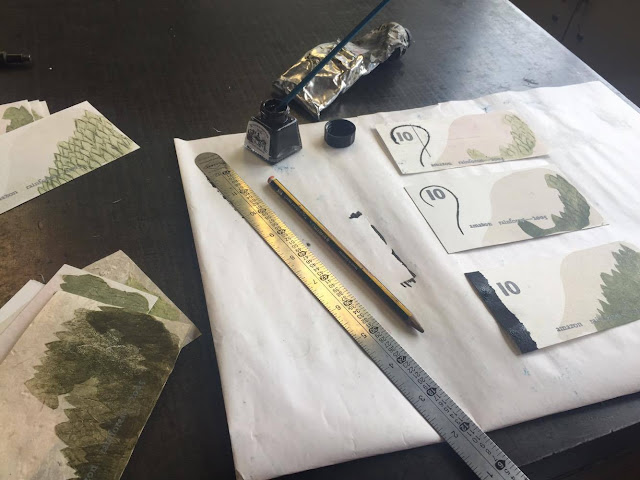
After cutting out the individual carvings, I experimented with different processes of applying printing inks with the intention of creating tonal qualities.


Print/Paint application process. The oil shown is used to clean the glass table, plates and rollers prior to soapy water. I tried to apply little quantities of ink through the roller yet they were constantly too dark. Instead of carving deeper into the lino I chose to roller a thick layer of paint and then ghost print the remainder of the ink on test samples, creating some really interesting looks. After a while of each print becoming slightly clearer, I 

Selection of coloured ink. As traditional print allows you to be more exploratory with metallics and colour pallets, I wanted to utilise this and include a subtle pale gold mixed with green to emphasise traditional processes. Ink is applied to the clean glass surface with a metal pallet scraper and rolled on in an upwards motion, allowing even coverage and a smooth cover of ink.

Experimenting with stock choices. G.F. Smith including Takeo Yomoshi in 118gsm, creating wafer thin textures. As my subject content is regarding deforestation, it was naturally paramount to used a recycled stock. I also opted to print on G.F Smith Parch Marque in 250gsm, Suffolk Handmade paper in 60gsm, Sweedish Handmade paper in 60gsm. All stocks bar Parch Marque are 100% recycled, including the handmade papers.


So far the process has ran quite smoothly, the textures created are what I was hoping for yet the bank note is still very plain and boring. On top of this I plan to letterpress and foil, adding two more textures both sleek and crisp to add a professional finish.

OUGD406// Speaking From Experience 01

As a response to the brief 'Speaking from Experience', we have to create a piece of information design which is engaging and helpful to first years settling in Leeds. As this can be quite a daunting time, especially if people become homesick, I intend to convey a light hearted tone highlighting the fact that first year is a time to find your feet.

Looking back to Freshers week, the items I collected most of were A4/A5 posters, simply for the ease of grabbing them to decorate your new student halls. With this in mind, I intend to create a poster or flyer to add a calming tone when the years getting tough. My intention through future design is to give a unique quality, standing out from other poster designs to create something a student/young creative would want on their wall.

My brief
"Create a piece of engaging visual communication, conveying that Uni isn't all that bad. I intend to calm students and produce a effective final outcome people would be proud to put on their student room wall".

Research //

Instead of looking on the internet for second hand flyers or inspiring posters, I thought I would address my target audience straight on. To obtain research for this brief, I photographed some of the flyers and posters still around our student halls, alongside individually collected pieces in peoples rooms. I feel that this was the best way to prepare me for addressing freshers, looking directly at what freshers want.


Initial ideas //

After conducting primary research, I decided to pursue the brief in a 2 dimensional way. My flat and I kept hold of almost no tactile publications or business cards, purely for the fact they weren't as ascetically pleasing or informative as the others. With this in mind, I will limit my design to a A4/A4 Poster or Guide Poster, providing a calming tone freshers can enjoy.


- Cooking Advice                                                 - Washing Advice
- How to get on with the flatmate that annoys you
- How to figure out which flatmate is going to annoy you
- Guide to meeting your flatmates home town friends
- What NOT to do during Freshers                      - Best underrated food/drink venues
- Yummiest Cheap eats                                        - What to do when a new flatmate is sad
- "Don't go to Pryzm!"                                         - Actually do all your work
- Blog as you go and book print slots in advance!
- An Art Students guide to life                            - A Student Designer's guide to life
- "If you see these items, buy them immediately..."
- Photobook exploring nice spots around Leeds to relax for free
- Map of the best and cheapest bars in Leeds     - Map of best vintage/charity shops in Leeds
- How to adult at University (doctors appointments etc)
- Best gig venues in Leeds

Initial Sketches //


Idea of a hipster pirate with one leg wandering around Leeds with the caption "C'mon mate, find your feet". Not a very strong idea as it will be hard to illustrate under such tight time constraints alongside people with one leg possibly find it offensive.


Map of Leeds with the best cheap bar spots. I would have to expand the size from A5 or use a 10pt typeface to mark what bar is what.