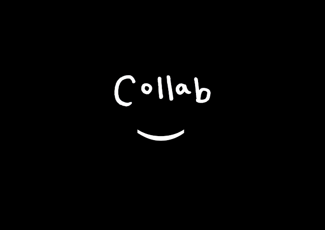
Final name: COLLAB
Short and snappy- straight to the point. The selection was made from the feedback I received about the branding, considering how the typography is displayed and not giving up on the introduction of the bracket to suggest the face. Moving away from a digitally rendered type logo to a hand rendered solution. The use of this medium highlights Collab are a platform intended at more creatives, studying art and design rated courses. The introduction of the bracket suggests a smiling face yet again, but in a much less subtle way, allowing a universal identity being built on this fact.
The target audience also said that the name collab needs no additional explanation in the art school environment, and other distribution methods, meaning the use of more ambiguous symbols to identify with collab is possible.
The colour palette is predominelty black and white with aspect of transparency letting the colour of the image come through sections. The rustic orange on the drop down menu's is (hexidecimal #C2895C). By keeping it black and white the removal of genders or subjectivity in design is present. The hand rendered logotype also perpetuates a humanistic quality, unlike Instagram/Facebook/The Dots which are all quite clean and corporate.
Listening to feedback I wanted to play on the use of symbols and integrate these within all aspects of the branding, including stickers, uni packs, tote bags etc.
Developing GIFS to illustrate the idea and be distributed via social media, illustrating the key icons used for the Collab identity. Each symbol reflects collaboration in some way, the thumbs up suggest 'good job' or even 'ey up', the peace symbol reflects a chilled out working attitude, the okay symbol has been reappropriated in popular culture to have cheeky emoji connotations, reflecting a more millennial audience.
Transferable icons for cover photo's on Facebook or posts on Instagram.


No comments:
Post a Comment