Feedback //
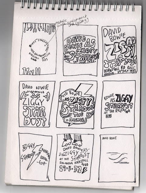
After pushing this design as much as I could, something still wasn't working, so I conducted some feedback to see what could be improved. The negative space/typography ratio was something of concern. At this stage, I felt the development was quite clean yet channeling a postmodernity- I wanted to go back to the drawing board to try and give everything a synthesised flow.
- Experiment with Hand Drawn typography, go back to sketches and see what works best
- Not sure about feet illustration at both sides
- If going for a groovy typographic style it should all fit in together, like the posters of the 1960's. (*Despite being influenced from 1960's posters, the gig was in the 1970's after this genre had faded slightly, furthermore Bowie does not incorporate a Jimi Hendrix psycadellic illustrative style in any of his works- so going all out in illustrative typography may not be totally relevant).
- Keep the type to just the outline, reflecting the illustrative style you've used.
- Scatter elements of bold type, contrasted with delicate skinny type (perhaps Groovy vs San Serif)
- Don't try and overcomplicate the composition of the typography, keep everything to the same wave flow.
More sketches with a closer emphasis to typography
Recapping to Bowie Illustrations
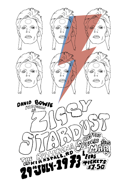
As David Bowie has so much widely recognisable iconography, it is essential I touch on at least one familiar aspect to encourage a familiar interaction between the audience and print. As Bowie preformed as Ziggy Stardust, the main piece of iconography present in the 1973 gig was the gold alien circle and a black and white retro-lightning bolt. The Rollerena tour was only a few months prior to the release of Aladdin Sane, where the debut of the red and blue lightning bolt was made. Despite not being iconic at the time of the July 73 gig, the print is intended for a modern audience so their perceptions of Bowie are probably strongly related to the lightning bolt, as it was his most popular and recognisable symbol.
After looking at these and getting feedback, I decided to push it further, clean up the hand rendered typography and concentrate my attention on these three- narrowed down from feedback.
Reworking the typography
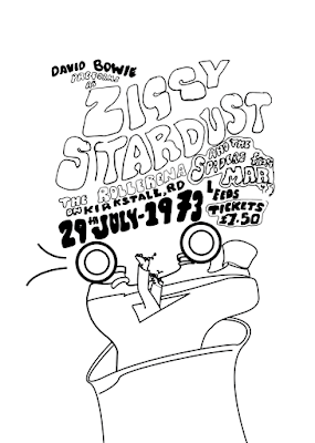
Cleaning up the typography, removing any unwanted marks on photoshop. After listening to feedback, it seemed the hand rendered presence was quite complementary to the traditional print style, so decided to keep some imperfections for authenticity. I altered kerning, leading and some stroke widths to emphasise fluidity and impact. I decided to alter the second G in 'Ziggy', replacing it with the same G as before, making the typeface (and hopefully design) look more cohesive and polished- rather than a sketch
.
 |
| 3 Alterations of the same type design, incorporating the movement of the Rollerena venue |
I plan to expose these designs onto screens, experimenting with coloured stock/ink combinations. To incorporate a roller print technique, it would be interesting to see how creating mono-printed backgrounds would look. Coloured blocks could highlight the sections of legs or typography quite intricately, or expressive roller marks could be made in the form of a mono print.
If time was more forgiving, it would be interesting to try and laser cut the design into wood block (or Lino), to create a traditional stamp effect, allowing a roller based practice rather than screen print, following the concept of fluidity further.


No comments:
Post a Comment