<Ideas mindmap>
Initial sketches
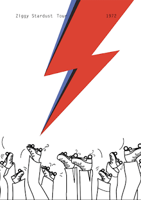
Capturing movement and highlighting the Rollerena as a unique venue. I tried to incorporate the 1970's flares, as seen in the photo series of American Rollerenas in 1973. This iconography hopes to add an element of nostalgia- even if the design does not come off as successfully as I would like, the audience should still know the gig was in the 1970's by incorporating visual signifiers and the playful elements of postmodernism.

Experimenting with digitising my drawings, turning them into digital illustrations manipulatable for a range of developments. Quick start on experimenting with type- trying to capture the fluidity of the event, whilst channeling the poster styles of the 1970's and rock and roll iconography.
Experimenting with Typography (Orator STD Typeface). I wanted to suggest to the juxtaposition between then and now- venue wise. The Rollerarena venue is no more, so I wanted to reflect this modernity through possible typographic choices.
As the piece is for an exhibition, I wanted to increase audience participation as much as possible, intriguing the viewer to get more involve with the piece. Inspired by a juxtaposition in history and public spaces, the tight condensed binary code aesthetic is a visual look at the history of the rollerena. Once used as a place of youth passion, sweaty gigs and fun for everyone has now become the ITV building on Kirkstall Rd. After some more research (and going to the building reception and speaking to a caretaker), its interesting to think that where the gig would have been, ie. the physical stage space and events room, is now home to the IT Dept, working mainly in binary code. The typography complies iconic phrases from each song in the set list, starting with White Light White Heat (the phenomenal start as commented on in articles), and ends with the encore, Drive In Saturday. Throughout I have tried to organise the lyrics in a sense that they are still coherent as a melody when you read through. No more than two lines from each track have been used, incorporating ambiguity and off-tempo sections to give the viewer the feel of a real song. The typography was positioned so small so the viewer in the exhibition space must interrogate the images, stand in front of it for prolonged periods of time (hopefully) to unravel the concept, as well as getting lost in Bowie lyrics as a narrative journey through the concert.
However, as the exhibition purpose means the print must be eye catching and engaging straight away, and I'm not sure if this has that 'wow' factor that Bowie does- nor does it fully represent the sweaty rock and roll rollerena venue (as the space in Leeds).


No comments:
Post a Comment