// John Lennon- Imagine
Optical illusions have been created through the digital manipulation of type, proving for an intriguing typographic series of covers. The type is featuring the results of the world becoming united and together in peace. I projected this through the typeface Baskerville, giving an aged ascetic similar to old documents- suggesting a shock factor that things such as 'Gender Equality' is a new thing.
A digital medium has been used to emphasise crisp detail, alongside traditional vector imagery. Furthermore, the covers need to be digitally uploaded to Secret 7" so this eases the deadline process.
 |
| The black and white contrast highlights each word/ statement, forcing the viewer to pay attention. After experimenting with distortions and seeking peer critiques it became unusual that all people could see slightly different things within the curves. This may be the result of a happy accident, yet for me I can see a strong elephant with his tail towards the viewer, whereas a peer could only see a dolphin jumping into a wave (?). This will be interesting in forms of dividing opinion, alongside suggesting that nothing is ever what it seems, a metaphor for the world/humanity/ accepting everyones own opinions. |
 |
| A tripper take on the previous design, with the type overlaid giving a more confusing/disjointed ascetic. The use of vivid Fuchsia and Cyan together is to emphasise the unity and fluidity of males and females, alongside creating a 60's psychedelic vibe. |
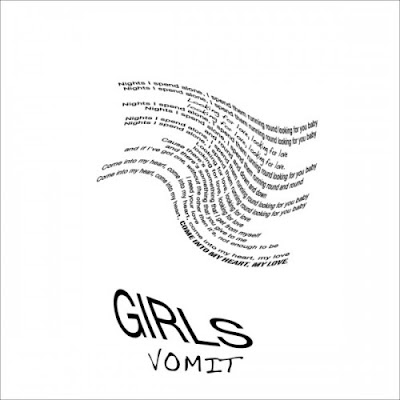
After getting really involved in this design, I was unfortunately made aware of a similar album cover already out there for 'Girls', Vomit. The fluidity of the wave and the three dimensional typography create strong links between our work, despite me never seeing this before. Due to this, I have decided not to take this optical illusion style forward, especially for a competition brief, incase it looks like I have copied 'Girls'.
 |
| To resolve the problem arose by Vomit, I tried to create a purposeful optical illusion with the same block of text. The intension was for a Rhino, one of the latest animal types to become extinct through human disfunction. Other people when asked can see a Tigers Claw and an Elephant with their head tilted. It seems with this illusion, when you can see one object its really hard see another. |
The life of John Lennon was partially spent fighting for innocent throughout the world, highlighted by the hit 'Imagine'. With this in mind I wanted to represent innocence in its purest form where we are all untainted and the same. Playing on the ironic truth that only wise people, grown ups or even men have the ability to change the world, I combined an old wise head onto the body of innocence, suggesting that anyone could make a change. In addition, the representation of this hybrid old man baby is quite humorous and 'random' in ascetic, possibly making unknowing viewers assume that this figure is designed for a band more incline to that style, e.g.: Chverches/ Tame Impala.
 |
| Repeat pattern with subtle differences. The top half has each baby slightly different, while the bottom are all the same, suggesting difference and equality according to the lyrics of Imagine. |
 |
| The foetus design has been duplicated into a sequence of three, reflecting how many times the 'Imagine...' chorus is used within the song. The change in colour suggests that we are all the same no matter our skin colour or ethnicity, an idea inspired by United Colours of Benneton 'Black/ White/ Yellow' campaign. However, the date is incorrect, the 1990 should be 1971 as the release date for 'Imagine'. |
Minimal compositional factors seemed to be the most effective through informal critiques. Inspired by album covers such as Biggie Smalls', Ready to Die, I adapted the 'wise foetus' design to be floating in a sea of nothing- simply 'blah'. The viewers attention is drawn to the crisp white lines contrasting the flat background; this could possibly be complemented with a parental advisory sticker on a bottom corner suggesting you need parental advisory to think.
 |
| For this cover, the colour brown was selected to reflect retro-ism and the whole 70's ascetic as a whole, leading the mind to the simpler days where peace could have some day been an option. |
 |
| Taking inspiration from publications such as The Independent, the introduction of a side column including the year John Lennon was assassinated is a subtle clue, alongside breaking up the composition. The dark green is to suggest regrowth and the possibility that someday 'you and me will be as one', alongside being a general connotation to peace and environmentalism. |


No comments:
Post a Comment