I found some interesting examples of this in Vogue May 2014...


Despite Vogues high class reputation for cleanliness and spacious quality, a suffocating layout is often present throughout the magazine. Despite the wide set layout connotating to airiness and openness due to the wide columns and spacial qualities, the sheer amount of copy is overwhelming. Despite being a keen reader, when I came to this article I genuinely thought 'can I be arsed?', so I can imagine that this amount of text would be a huge deterrent for 'flickers', and therefore a waste of time.

Both Negative Space and Suffocating space are shown here as a double page layout. The advertisement from Van Clef & Arpels incorporates shadow below the figure to intersect the negative space, whilst slightly incorporating a 'rule of thirds' style approach and having the top half of the layout very spacious. This is a perfect example of Ground acting as a background, also acting as thoughtfully considered 'white' space- in turquoise. The left article has a much more relaxed, collage feel to the composition engaging the viewer more than the last. However, the tight composition feels too condensed, possibly due to the scale of images and the copies relation too the imagary.


Further examples of 'White Space' within advertisements. This time both luxury brands seem to have a common theme with their use of emptiness- to lead the eye to the figure. In addition, the use of negative space (in any colour) also suggests luxury, as they do not need to cram all the information into one half a page layout- the brand name and open quality speaks for itself.
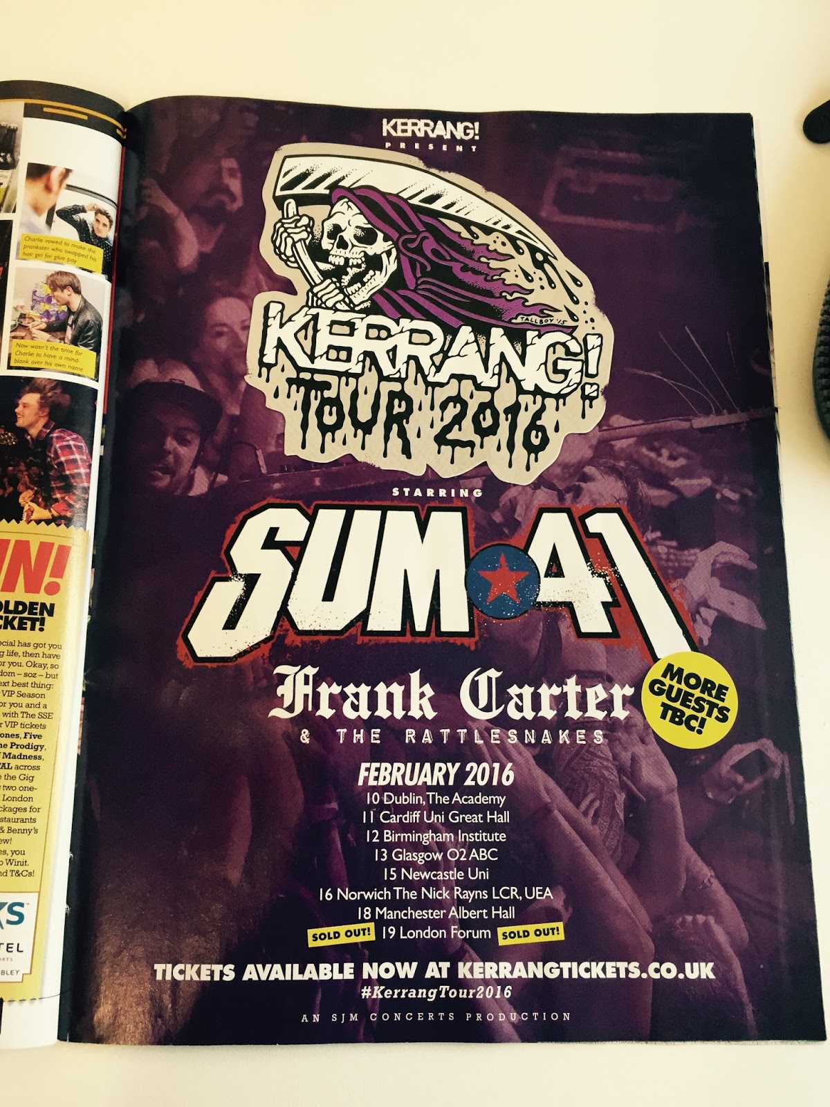

Contrasting to Vogue's approach on Figure, Ground and White Space; Kerrang take a different approach, possibly more appealing to their target audience. These are the two emptiest pages I could find within Issue 1593. As you can see within the left advertisement, it wasn't enough just to state the band name and 'Kerrang Tour 2016'. The use of reduced opacity showing concert-goers having a good time may entice the audience further and attend this event, even if it wouldn't necessarily be something they'd identify with without this visual iconography. Furthermore, the right hand image looks to be mirroring a 'fashion' style to showcase merchandise, incorporating lots of ground- yet it comes across as ill thought out. The white ground seems to merely acting as background, providing an area of calm highlighting the busy figures. It is interesting to see the ground breach the fold as this is not typical of this genre. It seems this has been done 1) to space out the products to avoid suffocation, and 2) leading the eye towards the 'Patches' section promoting add on sales.
Overall the tone and target demographic of the two magazines are very very different, emphasised by the price of each magazine and the calm vs busy structure featured within. It is also important to note how many pages each have. As Kerrang is constantly busy it is a thin 63 pages, contrasting with Vogues spacious approach racking in at aprox 265 pages.
No comments:
Post a Comment