So this is my first digital experiment where Typographic Manipulation is concerned. The slab serif style I tried to go for has not been consistently portrayed, with a range of styles and reflections of negative space running throughout. The weight and curvature is inconsistent in many letters (the F and G especially) giving a unprofessional look. In many cases the letterforms just look like those of another type, and not truly reflective of 'Immense's' manifesto. As you can see I stopped at H as this is the point I knew this was unsuccessful for this set brief, whilst looking like botch-up of several established typefaces.

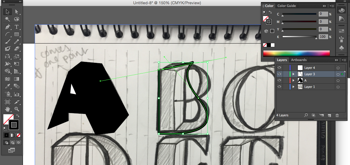
Following on from my final hand drawn type-piece I tried to digitally render the cubic silhouette idea. After completing the A, instantly I got connotations of Japanese style typography- a style I am not going for. The pointy nature from using the pen tool makes the angular quality more child-like than cubic. As I moved onto 'B', I could not for the life of me render the smooth curve to curve in the right way. For this reason, I am swaying away from drawing my own typeface and favouring adapting Berthold directly.

No comments:
Post a Comment