Studio Brief 02 challenges us to invent/redesign a piece of User Experience through design. UXD and UID impact daily lives of consumers more than people realise- something as simple as an automatic WiFi connection improves User Experience by removing the need to step by step, manually connect to the Internet.
This is a great opportunity for me to explore Interface design, focusing on Apps and Websites. Despite screen design not being on my radar for future plans- the premise of designing for an ever expanding need (technology) will always be in demand. To be a successful screen designer, not only does the technical foundation and attention to detail play a huge role, but the ability to understand and recreate emotive experiences onto the digital platform. Over time websites and app’s such as Snapchat and Facebook have changed beyond belief, placing the emphasis on how the program can make you feel- not just what it can do. By introducing filters, interactivity is physically placed on the user, making them engage more with social technology than ever before. To help with this journey, I will be reading and referencing HTML & CSS ‘Design and build Websites’, written by Jon Duckett, 2011. This book gives an illustrated insight into the technicalities of design for screen, as I feel that will be my biggest challenge. In the past the technical nitty grit-ties have always held me back, so hopefully, this will allow me to do something right.
Prior to my own investigation, as a small group we listed and discussed current successes and failures of UXD.
Current Interfaces
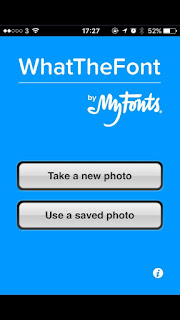
WhatTheFont - Example of poor interface design
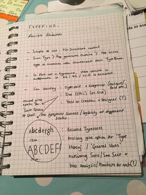
A stress free user experience seems paramount to avoid consumer irritation (well for me it is!). One app in particular which does not fulfil its primary purpose is 'WhatTheFont', a type finding solution by MyFonts. In the excitement of the briefing I had an initial go at re-outlining the app from what i'd read in the HTML&CSS Book, making it simpler at each point of User Interaction.
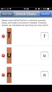
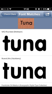
I have used this app many times in the past, and it has lead me no results- to test this again I ran an experiment to see if it could identify a simple, quite well known typeface. To do this, I selected a piece of print I could get a factual answer on what the typeface was- the answer being Futura.


Initial screens the user experiences, resulting in an incorrect typeface selection. It would be interesting to find out if My Fonts don't have the rights to feature such famous Fonts as Futura, or even if it stretches to Muller-Brockman's collection of classic and lead typefaces?
Primitive Idea's Generation
ASAP 54 is an fashion retailer, pioneering the 'Shazam for Fashion' movement. Its premise is simple- take a photograph of the item you want, and it will bring it up for you. Again, this does not work, so it may be interesting to embark on a similar project once again, incorporating a 'Shazam for Fashion' feature.


No comments:
Post a Comment