Tuesday, 29 November 2016

OUGD504 Design for Screen - The Design Process

Experience

Not quality of what they are reading, but the experience of interacting with print based media. Drinking a coffee in Starbucks alone, automatically alters when you're then reading a paper, it becomes like routine at times for many people and this is something I need to consider when designing solutions for my given problem.

Often scale of newspapers can become tricky, especially when stood up- perhaps in a tight environment where papers can squash and fall out due to the lack of binding. Everything can be both a positive, or negative experiences.

Research & Insight

Screen based research is equally as important as when designing for print. Consider:

Page Impressions

Unique Users: Specific characteristics, special requirements or unusual cases- what if one person doesn't fit the mould? Will they still be able to interact with it as intended?

User Flow: the journey one takes to actually get to the interface, and how they interact with it when they're on it.

One-to-One: Peer Analysis, qualitative feedback in focus groups or one to one.

Persona's: Putting yourself in the shoes of the target audience with a character persona in mind, walking through and interacting with it like they would.

SWOT Analysis: Strength/Weakness/Opportunity/Threats, both internally and within the external developing market 

Questionnaires: Any questions needed to solve the problem

Target Audience: You are not designing for yourself, and you are not designing for you client. Generally, the client is not the target audience of the product they're selling.
Can be individuals or companies, families or sections of the general public.

Is the interface designed appealing more towards men or women? How does this work and feel when put in the hands of the target audience?

Urban or Rural location? Whats their income? What devices do they use? How often do they engage with interfaces?

Economy or Premium? Whats the difference within the User Interface? As a user you'd want Premium to look and feel more luxurious. 


Consider why?

What is the specific reason they WANT to engage with the interface? Motivation (getting better or taking stress into their hands) and a Goal (to reduce stress L.T and have an overall better    ) is generally used. Do they need to do something to achieve a 'goal'.. Perhaps when the app can see 'phone mode' has been engaged, suggesting the user is ready to speak to an actual person? That in itself is a big step and therefore needs rewarding somehow. 

Is time on the interface seem essential or seem luxury and special? (Needs to be self indulgent)

Are they after something specific that none else can provide?

Do they need specific information about a product or service prior to engaging with it? (Yes, most people are sceptical so a thorough description is essential) 
 

Ideas generation

Come up with a range of idea's which are all completely distinct, in response to the problem

Moodboards/ Mindmaps/ Ideas Sessions/ 


Solutions

Minimum of two different idea's visualised through Wireframes and Sitemaps. All very sketchy and rough at the initial stage.

LoFi:

Comp: Mock ups on Illustrator/Photoshop, Interactivity through After Effects etc

Production
(only when a simple Wireframe and Site Map for 2 ideas has been created first)

Hand over all information to a programmer or coder for them to build fully


Site-Map

Get to any page, from any page. 

Need something to grab the users attention? 


Wireframes

Inform where information should be, making sure all information is where its meant to be. Put together a hirachy (importance of information), and how each page will interact with other pages/ how you get from one page to another.

Do not design beautifully at this stage, there is no point. Its likely things will still get changed around.


Next steps:

SWOT Analysis and further research, developing a range of idea's. 

2 totally different solutions brought to the Wireframe/Site Map stage.

OUGD504- After Effects Session 4

Timeline Layer Switches (eye on/off)
Shy layer:

Man ducking behind fence- used to hide layers without deleting them. Can tidy up dashboard/


Computer running slow?

Click on this to lower the quality of the preview to aid with loading times. Use Fx to turn on/off effects per layer. Motion blur adds a realistic slight blur, aiding realism by softening the edges etc. Must 'activate' the main motion blur Key Frame toggle as shown below (pt 2)


Lower the quality by clicking on
& making the line curvy
Adding Motion Blur


Activating the Keyframe for Motion Blur- will only work when this is selected
Adjustment Layers:

Any adjustment you apply to this layer, effects all of the layers beneath it. So, if you create a new Adjustment Layer, drag Black and White onto it- everything below this layer is affected. This allows you to block out or emphasise certain colours/effects.


Effects & Presets:

Drag and drop onto layer bar. There is thousands to choose from (similar to photoshop in parts)


Cutting out a section/Track Mat:

Draw rectangle, overlay it to the section you want to cut out. Use the below setting and play around with the settings until it works. This means you can bring in animated footage below, meaning it will only be visible where the rectangle is cut out.


Nesting Files:

Create a new composition the size of the still file:


By creating a composition at a smaller scale than the PAL- settings we usually use, means one animation can slot nicely inside another, without overlapping or being cropped at the edges.

Nesting Composition together (background and master)


Tuesday, 22 November 2016

OUGD405- Coding Lecture

HTML- Hyper Text Markup Language
CSS- Cascading Style Sheets *
Java- Android Language
Javascript- Advanced effects and added interactivity
SQL- Database Language
PHP- Server based Language
iOS- Apple Language
Ruby- Twitter


What languages do you/your developer need to know? If hiring the wrong type of developer, could loose big money. Very unusual for a developer to code in every languages, just like normal languages- some people specialise in one language more than others/cannot speak in some.

*Main two needed for standard web design. 21st Century designers need to have a good grasp on how these function, what they are and do.

Often, all webpages are not individually designed. There will be a series of pre-designed, functional web templates, yet the coding allows the database to pull up any information relevant (into the template), when the viewer clicks and demands the information. This is easier than pre-designing 3000+ webpages, whilst allowing the upkeep of the website much easier as the physical content is interchangeable. 

In the past, interactivity for technology/phone was done through flash. When Apple iPhone launched, nothing would compete with Action Script as it was unsupported on Safari and iOS browsers. Since, ActionScript has become obsolete, meaning that in the future- any of the above languages can equally fade out. 


Not designing for screen- designing for web browsers, such as:

Google Chrome, Firefox, Safari, Opera (used by Nintendo Wii), Internet Explorer

All of these translate HTML, as the Skeleton of the website. Web browser looks for HTML Files on Servers and then display the content to the user. However, the look and interpretation of the language can be interpreted differently on different browsers. Eg: one thing may work/look differently on Chrome than on Safari. This highlights the importance of knowing WHAT you are designing for, so it works 100% on that medium.

What devices would they be accessing it through?

Desktops, Mobiles, Tablets, Laptops, TV's. This will change the layout and aesthetics as the physical screen and template/orientation differs. Eg: iPhone 6 = Portrait  Web Browser from Laptop or Desktop = Landscape. This also impacts the UX and UI as the physical navigation alters.

Responsive Web Design is where it changes and responds to the device it is on.

You should be able to get to any page- from any page

The Hamburger Icon aids this, especially within Apple and Facebook- 3 horizontal lines which allows a slide out function to reveal tabs and navigation menu's. However, as this hides the icon people forget what is on offer- out of sight out of mind. By using the Hamburger icon, interactivity is interrupted and more steps are added (e.g.: clicking on icon, scrolling down perhaps, and finally clicking on the selected icon).

Nothing is Perfect, everything needs to be critiqued

Standard Screen: 96 ppi (higher quality images etc for screen) rather than 72 ppi. 

72ppi loads quicker on a page as smaller files.

Retina screens gave the option to display higher quality ppi, possibly challenging the quality of print (300ppi) someday. The higher PPI means larger load time, and a negatively effected UI. Most peoples attention span is approx 4 seconds. The average web user gives about 2.6 seconds until the page loads, if not there is a chance they could close the tab and go elsewhere. Design should load instantly, if not instantly then definitely <2seconds.

Accessibility

Screen Readers
- programs that read out the contents of  computer screen to a user. (Links to brief)

In Europe and USA its a law that every website should be accessible to everyone, e.g: blind/any impairments.

Then// This impacts the the design as the typeface is not installed to the website, it is installed to the users computer. If used a bisque typeface, or even one specialist to you, it would default to Times New Roman as that was a universally legible typeface accessible to everyone. On the internet the designer lost the control of pt.Size/Kerning/Leading which limited what could do on screen.

Now// Google fonts and Fontface kit means 'in theory' that you can upload a typeface and use it anyway. However, this allows the user to download the font from the website, breaking copyright legislation and allows the user to distribute it as they please (not a benefit and can perpetuate unfair practice and fraud). A licence is needed for the typeface (if its a Royalty typeface), or else source a royalty-free typeface (either specific for print or specific to digitally. Check small print and check there is no license fee attached to it or else billable at any point).

Its essential to consider who owns the rights to each section, as it has the ability (by being put online), to be distributed world wide.

Any type on a website is searchable by the search engine- images are not (there are ways around but not that easy).


HTML Coding:

Decides each element of a webpage with an open and close tag. They tell you something about the information- every piece of information has to be opened AND closed.

'p' means Paragraph. Research the alternative code formulas for headers, subheadings, images etc. All coding needs to be relevant to what it is opening and closing.

Opening tag: <p>           Closing tag: </p>

Needs to be include in each website- if not, it will not work:

<html>   +   </html>
<head>   +   </head>
<title>    +   </title>
<body>  +   </title>


Cannot rely on WYSIWYG Applications (What you see is what you get), as without knowing the basics of coding things can still go wrong through translation. A good example of this is Dreamweaver. Can't use Dreamweaver without knowing coding, the WYSIQYG is abysmal. MUSE is a visual website-mock up.

Meta-tags are what search engines use to find websites (Key Words). Not visible in website but within the structure of the website.


Learning   -              https://www.codeacdemy.com/learn/all

Codecademy is a good online way of learning the command line of coding, the framework and effectively how to deploy a website. The Hungry Sandwich Club learn't almost fully through CodeCademy, prior to employing a trained developer.


Monday, 21 November 2016

OUGD503- Responding to YCN Greenhalls Gin (1)


Responding to the brief

After exploring further briefs for the Responsive model, I had to consider the larger implications this brief has towards my portfolio. Despite a defined concept underpinning the UK Greeting Card brief, the relevance of greetings cards and stationary paraphernalia in my portfolio isn't really needed. I want to be aiming bigger, pushing myself and create a large body of work (ideally away from screen). In addition, after some informal research into UK Greetings Cards, the idea I wanted to explore was not really applicable to their current style, or target audience. The commerciality of UK Greetings Cards connotes possotive messages- pretty patterns and lots of colour. Sadly, I feel if I was to explore work like this, I feel it would be more worth while on a less restrictive brief that won't be monopolised by surface pattern design and illustrators.


The loose wording of the Greenhalls brief- "design a piece of creative"- suggests any medium is accepted rather than the confinements of commercial gift wrap etc.


Greenhalls:

Really established 1870 when Edward Greenall purchased the Dakins Gin Distiller, and subsequently inherited the Origional recipie. Dakins seems to be proud of its northern routes- sharing a hometown with Greenalls. 


Is Greenmails the alter-ego targeting the south, suggesting a countrywide unity? Or is it targeting ‘London’ to emphasise the Britishness intended through the brand?
  • If anything, when one thinks of London Gin / 18th Century London - images of Sweeny Todd days are created, with streets littered with poverty and disease. By having ‘London’, aren’t they hinting to the negative aspects of the past more so than the positive ones? 
  • London 18th Century: Grey, Grim, Disease  (the opposite to contemporary and modern)
They are currently positioned in the market as an old fashion, basic drink. The iconography and brand ambassador (the Queen), hardly promote a hip, youthful tone of voice- nor do they need to.  Their current advertising is relatively clinical, easy to understand and extremely legible. The appeal is on traditionalism- something close to Greenalls heart.

Official full logo to be used within all 'creative'- aspects of the logo (e.g. the illustrative crest or vertical green bar component) can be used individually if appropriate and wrapped in the Greenalls identity. The have expressed a desire not to alter the branding, suggesting they are happy with the way things currently are- are just slightly stuck on how to increase popularity.

The logo can be broken down into Futura Medium and Bodoni Old Style, with a minimal multi-green and white colour palette.


Target Audience


The 'creative' should be targeted at Millenials. Generally referred to as anyone born before 2000, yet when looking at statistics, this is actually a vast misrepresnetation.


Target Millennials :

People who drink Gin are interested in a quaint Gin drinking life (a bit like their mum).

World Gin Day: 11th June  - Could create an event or compose a launch night around this time? (Deadline March 23rd) 

http://www.independent.co.uk/extras/indybest/food-drink/best-gins-tanqueray-bombay-sapphire-10300262.html

Quintessential British Events:

Street Parties Jubilee’s   May fair (Mayday)    Bonfire Night      Picnic's 

Loosing your mum in the supermarket        Two busses coming at once          Queuing and then apologising 

The Countryside      Tea Parties         Boat Rides          Cricket         Croquet       BBQ's in the rain


Events through British History:

  • Canals and UK’s Industrial Revolution, linking Warrington with London
  • Bad reputation with Gin. Poverty and disease outbreak. Gin cheaper than Water, trend came over from Spain and lead to increased disease and poverty. 
  • Religion (risky topic)-  especially with alcohol.   
  • Overcoming adversity (War, Slavery, Bad modern times- relates to all the bad shit of 2016 *takes sip of G&T and all okay*)
  • Fish & Chips

GIN  (Bad history turned good)

What’s gin to me may not be gin to you. And there is nothing "old-school gin-makers" love more than to gripe that some newfangled “gins” aren’t actually gin. 

There are two primary ways to flavor your gin: You can either add flavors to a distilled spirit and bottle it, or you can infuse botanicals into the spirit by distilling them together. Depending on your chosen method, you get a different kind of gin, and a different flavor profile.

For example, if you want to qualify as so-called “London gin” (eg: Greenalls), you are only allowed to flavor your spirit through the distillation process. This is obviously more difficult to do then simply spiking your spirit with a flavoring compound, but the style is revered by gin purists.


“Greenalls- since the start.. until the end” .. homecoming drink, used to celebrate and revel in excitement. Suggesting a positivity in the aftermath of 2016’s events"


Imagine you’re an old-timey sailor venturing into the malaria-ridden tropics. Quinine-containing tonic water will help ward off the parasite, but it does taste bitter! One way to make it more palatable: Mix it with gin. According to legend, this is how the gin and tonic was born.


Gin was introduced into England by soldiers returning from campaigning in Holland–hence the origin of the phrase “Dutch courage”


“ Like most attempts at prohibition, this proved a failure, and according to Gary and Mardee Regan in their book, The Martini Companion: “So drunk were Londoners at the time that plays had to be canceled because the audience were too befuddled to sit still and the actors too were too drunk to remember their lines.” 


The widespread evils caused by gin are vividly depicted in William Hogarth’s infamous “Gin Lane” engraving in which the “Gin Royal” tavern advertises “Drunk For a Penny” amongst scenes of drunken abandon, and a certain Reverend James Townley opened a poem of the same name with the daunting line: “Gin, cursed fiend….” "


Gin started to become more popular around 1870’s and reached its peak when the Martini was created.

Demand is higher than ever for gin in Britain. The number of producers has risen by over 100 in the past five years. And the juniper-berry-disaster-zone has been made worse by the sharp decline in    the value of sterling after Brexit.

"Whether on a hot day sipping cool gin and tonics, or out on the town nursing a martini, gin swings."- Nick Passmore, 2003, Forbes.com


http://www.forbes.com/2003/06/03/cx_np_0603feat.html


Brief Conclusion


People who drink Gin want to feel sophisticated, an exceeded self esteem due to the trends of the recent past. They want to buy a sense of idealism, that everyday could be this regal/refreshing - leading to a sense of improvement- just from drinking this drink. 


Greenalls brand identity needs to be carried through any form of 'creative'. My personal intentions is to challenge the brief and create an idea with feasible success.


Tuesday, 15 November 2016

OUGD503 - Responsive Initial Ideas


Nihalistic / Realist greetings cards and stationary paraphernalia
  • considered the opposite of ‘cheery’ messages which beat around the true reason someone is sending a card. They are sending someone a piece of communication fundamentally to connect with them- send them a message or transmit a positive feeling as an act of good will. 

  •  People also send greetings cards because they often don’t know how to say/word something. They want to tell their friends ‘happy birthday’ or ‘congratulations on your new house!’.. what they don’t celebrate are the true achievements in life which actually need celebrating. Personal hardship, deep emotional trouble or dark periods in individual lives or even as consolidation for a nationwide issue eg: ‘Sorry your friends elected Trump’ or ‘Fuck that looser, He was a piece of shit anyway’, applying the reversed concept to a range of audiences.
  •   After doing some online research into current cards on the market that target emotional needs, it shook me how none of them were actually designed FOR the receiver. The person receiving this card will probably find it a surprise, someone would go out of their way to do something nice like that- but these words are foany. Their purpose and design suggest they are designed to make the sender feel better about doing something, rather than to improve the receivers mindset and long term quality of life.
  • Granted, greetings cards by nature have a short life span, often thrown away after a few days. However, cards with significant meaning that touch an individual, perhaps a hand written message written inside is hard to let go of. Those few cards, wedding cards/anniversary cards/event specific cards are hidden deep in everyones houses for sentiment, a feeling that ‘it will all be okay’.
  • When considering an primary audience of Mental Health sufferers, first hand research is necessary to best communicate what actually wants/needs to be heard. As person with severe mental health issues myself, metaphors and sad illustrations are just patronising. As are cards which give off the same vibe as a condolences/funeral card. 
  • Despite conveying some difficult/unorthodox messages, I want the purpose to remain on betterment of the receiver. 
  • Small tearable section the receiver can keep in their purse/wallet as a reminder on how to calm down

    -When you tell yourself ‘stop crying’ its a little card in your purse with some breathing exercises or similar message as a practical solution to ‘just get it together’. This is not a solution to prevent manic episodes (or bouts of depression), merely a tool accessible to help when such things arise.

Find Out:

  1. Everything and anything that had helped people in the past   
  2. Explore the connection between colour/design style and target audience

Outline of Concept:

‘Greetings cards to say the things you really can’t’.


OUGD504 After Effects v2

Bringing in PSD compositions


Always bring thing as

File>Import File>'Composition- retain layer sizes'. Without the 'retain layer sizes' option, the objects crop to the size of the Composition, meaning animating can be problematic. Eg: Narrower cloud layer means they can't move as fluidly horizontally.

Creating and building compositions in Photoshop:

When setting up the document in Photoshop use the Film and Video setting. New versions of Photoshop also has settings for App Design, such as iPhone 6 and previous. This will be a useful preset to consider when starting designing for the new Studio Brief. By designing/compositing the scene first in Photoshop, you can directly import it (see above), to save the fuss of doing it again in After Effects- especially when you're more familiar to Photoshop and new to After Effects.


Speed of Animation:

Hold alt key to effect the way numerous key frames interact with each other, speed up and slow down. The space between key frames determines how 'erratic' the shape is. Eg, if rotation is set to a higher number, yet the distance between keyframes is only small- it will need to spin alot quicker to fit in the high number of rotations.

Saving the Project:

File> Save As> _________ - This just saves the project as it is, it does not export or package.

Just like InDesign and Premier, you need to make sure all assets are with the file in a 'package', to enable editing in multiple macs. To do this

File> Dependencies> Collect Files>All

Just like InDesign packages Fonts, Links and Spreads, After Effects does the same thing and saves it as a folder all together. By doing this, you are guaranteed each component is there when you next return to the composition!

Exporting for different formats:

Composition> Add to render queue>format options>H264>Ok

Friday, 11 November 2016

OUGD504 Design for Screen - Initial Briefing & Problems in Current Interface Design

Studio Brief 02 challenges us to invent/redesign a piece of User Experience through design. UXD and UID impact daily lives of consumers more than people realise- something as simple as an automatic WiFi connection improves User Experience by removing the need to step by step, manually connect to the Internet.

 This is a great opportunity for me to explore Interface design, focusing on Apps and Websites. Despite screen design not being on my radar for future plans- the premise of designing for an ever expanding need (technology) will always be in demand. To be a successful screen designer, not only does the technical foundation and attention to detail play a huge role, but the ability to understand and recreate emotive experiences onto the digital platform. Over time websites and app’s such as Snapchat and Facebook have changed beyond belief, placing the emphasis on how the program can make you feel- not just what it can do. By introducing filters, interactivity is physically placed on the user, making them engage more with social technology than ever before. To help with this journey, I will be reading and referencing HTML & CSS ‘Design and build Websites’, written by Jon Duckett, 2011. This book gives an illustrated insight into the technicalities of design for screen, as I feel that will be my biggest challenge. In the past the technical nitty grit-ties have always held me back, so hopefully, this will allow me to do something right.

 Prior to my own investigation, as a small group we listed and discussed current successes and failures of UXD.

Current Interfaces


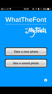
WhatTheFont - Example of poor interface design


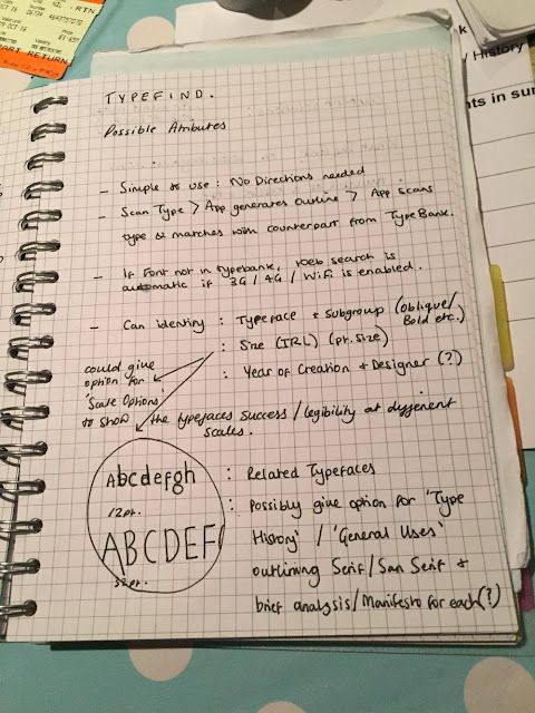
A stress free user experience seems paramount to avoid consumer irritation (well for me it is!). One app in particular which does not fulfil its primary purpose is 'WhatTheFont', a type finding solution by MyFonts. In the excitement of the briefing I had an initial go at re-outlining the app from what i'd read in the HTML&CSS Book, making it simpler at each point of User Interaction.

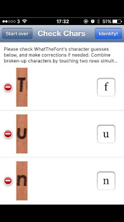
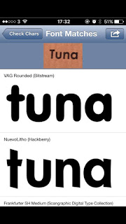
I have used this app many times in the past, and it has lead me no results- to test this again I ran an experiment to see if it could identify a simple, quite well known typeface. To do this, I selected a piece of print I could get a factual answer on what the typeface was- the answer being Futura.


Initial screens the user experiences, resulting in an incorrect typeface selection. It would be interesting to find out if My Fonts don't have the rights to feature such famous Fonts as Futura, or even if it stretches to Muller-Brockman's collection of classic and lead typefaces?

Primitive Idea's Generation


As a primitive case study to get my head into the swing of App Design, it was quite easy to point out where the application is going wrong- and how to make it simpler. After discussing this initial idea with others in the class, I need to keep my options open at this early stage so not to rush into a re-design too quickly. Over the summer, I tried setting up my own business based on an App which was not fulfilling its potential.

ASAP 54 is an fashion retailer, pioneering the 'Shazam for Fashion' movement. Its premise is simple- take a photograph of the item you want, and it will bring it up for you. Again, this does not work, so it may be interesting to embark on a similar project once again, incorporating a 'Shazam for Fashion' feature. 


OUGD504- Adobe After Effects

For Video effects
Broadcast based settings

Can't start any work in After Effects until you create a new composition - just like you couldn't draw in PS prior to creating a document.

Composition>New Composition


PAL setting gives a good generic outcome (AE version of A4), yet this is unspecific. If you wanted to create something specific, eg for an iPhone, simply program in the specific size and it sets is for you as normal. This will now be the perfect size for the iPhone screen without any rendering needed.

Work at frame rate of 25 and set the time. Default is 30 seconds- again this can be altered ad shortened.

Likewise with background colour.

Composition created!


Can't do anything until you bring work/information ito the Project bar- this can include Photoshop/Illustrator documents/ Import from Premier/ Import Music and other videos/ Import images from online etc


Layer>New>Solid>Set Size (can be composition but generally just a small shape)


OUGD504- What is User Experience?

User experience is term used by Graphic Designers, programmers and tech-developers a like. It refers to the qualitative values one can gain and expect from a digital program- just as they would gain or expect in normal life. By tapping into emotive qualities, the designer has a better understanding of how to re-create these emotions to subtly influence the user, or even market to them subconsciously. Dopamine is an addictive toxin produced in the brain when stimulated with certain pleasures- alcohol, drugs, gambling and even social media are used to trigger an influx in dopamine, and when this occurs the user finds it hard to stop.

A recent interview outlines the toxicity of heavy social media use and the connection to dopamine in the brain. By knowing how to create a pleasurable experience, doesn't mean it has to be addictive- it can simply inform practice. All of these pleasurable stimuli contribute towards User Experience (wether positively or negatively), but by tapping into real emotions, a real journey/connection can be formed.


Hassenzahl and Roto 2007

An achievable journey can be created through an 'Experience'

Phenomenology is a branch of philosophy dealing with subjective experience, experiences can change to external and personal factors- giving each user a subtly different experiences.

This can be experiences derived from subconscious or consciousness.
Find a way to measure subjective experience

Qualities of a effective Graphic Designer:

Problem Solving skills
Visual literacy
Critical awareness
Cultural knowledge
Interdisciplinary skills

All of the ways they receive design or text is mysterious to us due to this subjectivity- need to tap into the overall experience to interrogate individual experience and consciousness.

Subjectivity

Aspects and theories of subjectivity play a private role in GD Practice, certain factors of subjectivity for the understanding to the individual, including: Gender / Sexuality/ Desire/ Identity. These aspects were adopted in Ernest Dichter's "motivational research" which explore often hidden motivators in consumers, an extension of Freud's theories to the hidden re-pression we all experience daily.

"Vance Packard - Hidden Motivators"

In his talk, NYX3 James Crudely talked about the important of using "meaningful" photographs throughout UXD process to provide context and meaning to the design iterations.

Spacial Perceptions in Design

Graphic Design is a balance between aesthetic appreciation and communication that places the end-user at central motivations. By understanding the User Experience and critical awareness of society and the evolution of the ease of technology, we have the ability to create the solutions of tomorrow- today. UXD is non the less subjective, each user has the capability to have a completely different enjoyment/dislike/annoyance/excitement, than their others