

 |
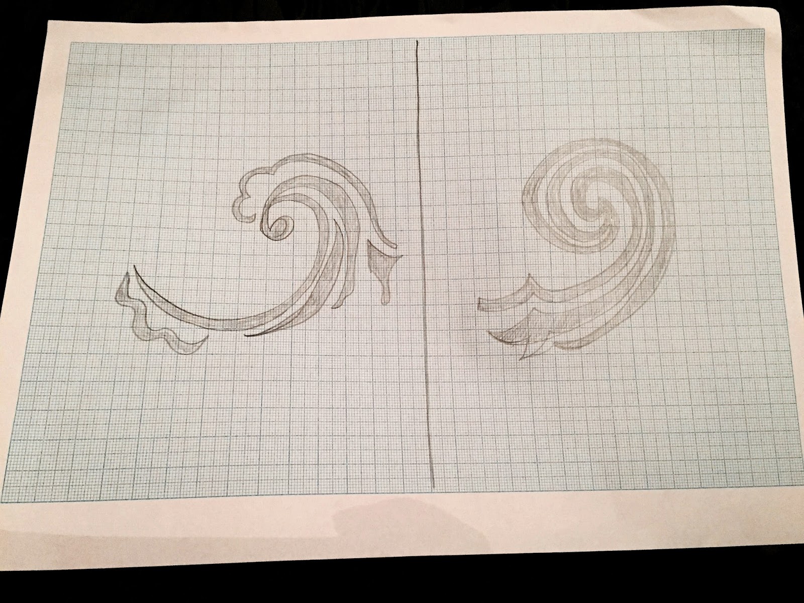
| Exploring simplistic compositions has proved effective, yet as the surface area needs to be covered for the bottom layer to shine through, scale will need to be increased. These circular compositions may be slightly too artificial and unrelated to the 'lonely water' video, which generally highlights flatter waters- such as lakes or deep ponds. |
 |
| After asking peers what their preferences are throughout all sketches, the sketch to the right gained the most positive feedback, well as possessing a slightly flatter nature than the circular compositions previously featured. This wave has a sharp vicious top, suggesting drama and power, yet calmer but equally menacing lower layers. The five layers also suggest the depth of water that may not necessarily look deep. |

 |
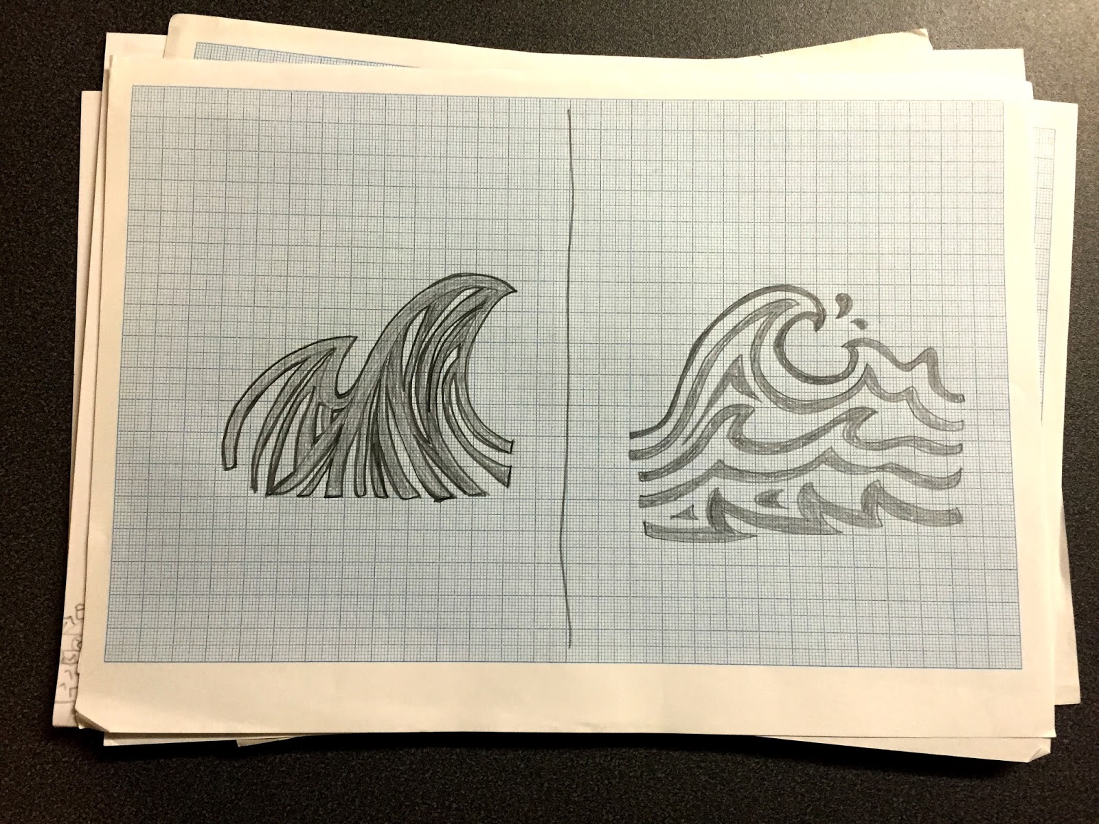
| When considering how to show the wave, I asked several people around me to draw what they think a wave should look like/ be represented as. |
First mock ups //
Inspired by the wave idea raised in the group critique, I created some mock ups out of coloured cards to see what sizing/ colour combination works best. In addition, I wanted to see how much of the under colour would be exposed, for future consideration of the inside pamphlet.


Experimenting with colour combinations was a key advantage of this task. Despite looking white on the images, the outer layer was a pale grey/ sand coloured card, which I thought would add a striking contrast against the inner blue. When consulting others, they all said that this was effective, yet it was suggested that the grey pigment be slightly darker, decreasing the chance of dirty fingers/ marks ruining the overall ascetic.

When considering what side the slider should come from, I asked several peers around me resulting in a majority verdict of the bottom. This raised concerns with others that the insert may come loose by accident, yet if the sizing is tight enough it should act like a snug fit.
No comments:
Post a Comment