Before turning to the computer, I wanted to make sure the sleeve design was going to be as successful on screen, as when reproduced. With this in mind, I revisited my message of 'Any Water Kills' to obtain further feedback. After speaking to 4 children aged 11-12 who were siblings of friends, 3 / 4 said that they would respond better to a striking message rather than a "childish" image, "like a wave".
With this in mind, I felt best to pursue a route with a mixture of typography and imagery, yet heavy in negative space so it didn't bore/ alienate them. I also wanted to avoid making it over child like, aiming to appeal to the 'grown up' transition they are feeling.
Type Experimentation //


Mock ups //


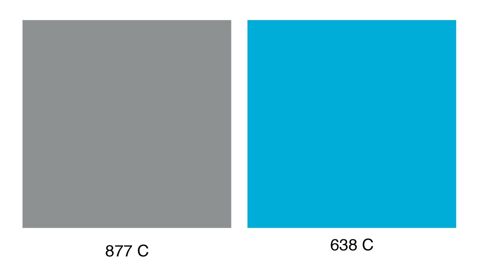
Considering Stock and Colour //
When considering stock and colour combinations, 250 gsm is needed to support the laser cut aspect, as well as making the interactive element more sturdy and tactile.
 |
| Rows of stock in Fred Olgers |
The sleeve colour is intended to be a mid grey, ideally around Pantone 7543 U. To complement this, the blue should be around a vivid pastel blue, ideally Pantone 551 U P.


No comments:
Post a Comment