When looking at typesetting, the main areas of design to consider are Modernism or Posmodernism. As everything in design, the overall ascetic and design decisions have to be influenced by an underlying message or genre. It is evident that both of these genres strongly influence different ways of typesetting to emphasise different styles and connotations.
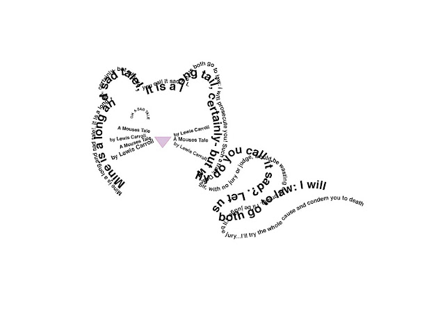
On the other hand, Postmodernist design completely brakes the rules of Modernism, by experimenting with legibility in a very expressionist manor. The use of Concrete poetry is also something to consider. This is a new term to me and basically means setting type as image or building up a narrative where type is centre. With this in mind, I created a few specimens based on 'The Mouse's Tale' by Lewis Carroll.
Experimentation with Modernist typesetting. By using a Flush Left alignment, legibility and readability is of ease, alongside minimising strain on the eye by not having too much of a jagged outer edge. Futura has been selected for this experimentation due to its curation date, prompting the start of Modernism- alongside being favoured by admired modernist practitioners, such as Massimo Vignelli. Only two type sizes have been used to keep a minimal ascetic, swell as consideration to minimise unjustified line sizes, including Widows and Rivers.
Above are a range of Postmodernist responses to this study task. I experimented with Modernist structure, yet included a range of unorthodox type sizes and Oblique quotations. The top design includes heavy gaps and negative space, differentiating between quotes- increasing readability despite a sparse ascetic. Furthermore, space and weight have been considered giving a manuscript/ play script conversation, increasing height sizes of the most important words. Finally, Postmodernist typography does not have to be fully readable; with this in mind sections of the passage were chosen to form a mouse shape, emphasising the illustrative genre.


No comments:
Post a Comment