Tuesday 29 December 2015

OUGD405// Wayfinding 03

After researching theories of ways people best respond better to arrows, I have chosen to conduct my signage in a block arrow, encasing all information whilst pointing the way. 

Colour // 
University of Leeds undertakes several colours in its colour scheme, for all e-commerce and branding it generally sticks to the monochrome colour scheme, oozing sophistication and complying to its timeless reputation. However, on campus- all signage and way finding systems are a dark olive green. To introduce a speck of colour and introduce a theme to the city wide Wayfinding systems, it is integral to find the best use of incorporating this colour. It has been said that the full fill back colour of the green is not only distracting and gaudy, yet will be significantly more expensive to produce.
Logo option 1: Broadcasting tower slightly breaching the page which is effective from a composition/ascetic perspective, yet from a practical printing point of view this will be difficult and expensive to produce due to the additional size of material and cutting costs.


Public Information Video/Research

The overall message of 'Lonely Water' is to not play by the water, as death is always waiting in the most ordinary of places. The public information film is targeted at young people and parents alike, with the intention to educate naive children to not be "fools". The narrator is emphasising many horror connotations by posing as the dark spirit of the lake, personifying the visual associations we relate to 'Death's' astetic. 
He is giving a shocking warning, calling the children/ young adults who ignore the 'Don't Swim' signage "easy targets" and purposely laying traps beneath the water to catch them out. Death identifies that these environments as easy places for accidents to happen, no matter how calm or peaceful the top of the water looks. His tone of voice almost suggesting he wants these 'accidents' to happen, further highlighting the evil which could be below the water. The tone of voice is dark and eerie, emphasised by the smoggy lighting and unobtrusive camera angles observing the scene. 
The viewer is placed in a position to watch but never help the "show offs"; Death may even be suggesting they had it coming.  However, the clear distinction that he has no power over 'sensible children' acts as an intensive- be sensible and you can keep your life.


The opening scene from 'Lonely Water' personifying horror connotations through the dull light, foggy depth and untamed wastelands encasing Death, intended to scare/ shock the audience. 

Introducing the primary target audience, 'cocky children'. Yet this can also relate to people who can identify with children like this, such as parents/ older siblings/ teachers.

Under the water what they can't see- jagged edges and easy traps curated to look sharp and menacing, again to shock the audience and imagine what it would be like to have a food trapped in the metal.


Monday 21 December 2015

OUGD405// Wayfinding 02

When considering what route signage to re-design, the most relevant one for me was the route TO University from Student accommodation. On the first day a swarm of students (myself included) left the gates of Liberty Park, Leeds with not the slightest clue of where we were going. If it wasn't for Google maps or Uber, we would of all got a lot more lost than we did. 

On some main routes there is a cycle route blue arrow, yet the parts where they are most needed (e.g: Do I turn left or right here?), there is nothing- a simple fix to add more arrows. Despite 'Universities' working to point towards the general direction, once we are in the university district, it is necessary to have differentiating signage pointing to each university individually.

Prior to designing individual Wayfinding Symbols for each university, I looked into their original identity so they are as appropriate as possible. 

Their current logo incorporates the famous clock tower, looming over the Parkinson Steps. This iconography is instantly recognisable as University of Leeds, despite the simplistic Black and White logo colour scheme differing from the deep green shown around campus. 

Everything is based off the hexagonal motif, originating from the Vernon Street mosaic, emphasised by the bright fuchsia well known by the students/ prospective students. The Serif typography emphasises the historical routes of the Art School, further incorporating to their identity.


Logo is simple and spherical, the linear smokey lines suggesting fluidity could possibly connote the waves of music. The San-Serif contrasts the Leeds College of Art branding, suggesting modern values and possibly even futuristic in appearance. 


Neither Leeds College of Art or Leeds College of Music have a particularly unusual building for their students/ prospective students to identify with, which is strange as they are the two most creative Universities within the city. With this in mind, for the 'subject specific' Universities I need to focus on the specialisms rather than the physical appearances. 


Leeds Beckett incorporate a 'flower' as their logo, which is actually ambiguous human forms wrapping around- suggesting togetherness and unity perhaps. It is interesting that this is their logo, despite having really unique buildings within their campus (such as Broadcasting Tower).

Creating Symbols //

Possible symbol for University of Leeds, as UoL is not a specialist university, I took inspiration from their current logo and easily identifiable landmarks- being the clock tower. The simple vector style can be easily transferable into different colours, possibly the dark green of the current signage, whilst working at both large and very small/ distant scales.
A first draft of a possible symbol for Leeds College of Music. The use of the circle is inspired by their current logo, as well as the musical lines referencing the smokey fluid lines projected throughout the entirety of their branding. Well known musical symbols are used as iconography so even the unknowing will be able to see a musical theme, thus leading them to to know it is representing Music College. 

Possible symbol for Leeds Beckett University, clearly identifying Broadcasting tower- Beckett's most identifiable landmark. However, if this was to become a final symbol confusion could arise for students trying to find other buildings, thinking that the Way finding system would only take them to Broadcasting Tower.
To amend this, another possible resolution for Leeds Beckett could be simply using the generic logo, identifiable and  well known throughout the city and by all types of students. 

Experimentation for a Leeds College of Art symbol. Incorporating the identifiable Fuchsia, alongside notable art vectors such as an easel combined with the year of establishment, paint brushes and a Henry Moore sculpture- a well known alumni.
Inventing a new pedestrian pictogram// 

As the audience for the new walking man will be students, a slightly youthful characteristic was intended by incorporating the headphones and back pack. As the target audience of the Wayfinding system will be walkers, I felt it essential to appeal to the characteristics they generally all share, such as listening to music when walking places. This will hopefully have a more engaging relationship between the signage and the target audience- as it is specialist and identifiable to/with them.


Tuesday 8 December 2015

OUGD404// Typesetting

When looking at typesetting, the main areas of design to consider are Modernism or Posmodernism. As everything in design, the overall ascetic and design decisions have to be influenced by an underlying message or genre. It is evident that both of these genres strongly influence different ways of typesetting to emphasise different styles and connotations. 

When looking at Modernist design and typesetting, Grids, margins and columns are used to create crisp alignment- whilst also giving a formatted structure transferable throughout. The type alignment is considered when curating type size and relationships to minimise orphans, widows and rivers. The ascetic of having Orphans/ Widows and Rivers looks unconsidered, alongside making it harder to read tiring out the eye quicker.

On the other hand, Postmodernist design completely brakes the rules of Modernism, by experimenting with legibility in a very expressionist manor. The use of Concrete poetry is also something to consider. This is a new term to me and basically means setting type as image or building up a narrative where type is centre. With this in mind, I created a few specimens based on 'The Mouse's Tale' by Lewis Carroll.


Experimentation with Modernist typesetting. By using a Flush Left alignment, legibility and readability is of ease, alongside minimising strain on the eye by not having too much of a jagged outer edge. Futura has been selected for this experimentation due to its curation date, prompting the start of Modernism- alongside being favoured by admired modernist practitioners, such as Massimo Vignelli. Only two type sizes have been used to keep a minimal ascetic, swell as consideration to minimise unjustified line sizes, including Widows and Rivers. 


Above are a range of Postmodernist responses to this study task. I experimented with Modernist structure, yet included a range of unorthodox type sizes and Oblique quotations. The top design includes heavy gaps and negative space, differentiating between quotes- increasing readability despite a sparse ascetic. Furthermore, space and weight have been considered giving a manuscript/ play script conversation, increasing height sizes of the most important words. Finally, Postmodernist typography does not have to be fully readable; with this in mind sections of the passage were chosen to form a mouse shape, emphasising the illustrative genre. 

Thursday 3 December 2015

OUGD404// Folding Techniques


The brief had us looking at experimenting with folds, based on an A4 size piece of paper. After looking in 'How To Fold' by the Peppin' Press I found the most innovative and unusual fold which i'd never seen before was the one shown above. The slice method gives another tactile quality to the 'fold', possibly being most interactive for less serious publications.  Naturally, for the effectiveness of this style to be maximised, it is essential to be created out of a heavy weighted stock.

In response to this, I created a really simple 'fold' guide showing how to create accurately. Naturally so it would fold professionally the proportions need to be accurate, hence why emphasis was added to the the numeric sizing. This has been a useful exercise for me when considering the Design Skills brief, as this is definitely something to consider in the future depending on the target audience for the publication. 

Tuesday 1 December 2015

OUGD405// Experimenting with Photography

The photography induction this morning had us investigating and trying to understand the use of ISO, Shutter Speed, Aperture and depth of field. It was interesting to find out the f/number correlation is really related to the level of darkness rather than light. The larger the number the less light is let into the lens, meaning a darker image...


A relatively fast shutter speed, complemented with a low f/number has been used. Naturally I expected the natural back lighting to darken the image, so I counteracted this by allowing more light to come into the lense. On manual mode the auto-focus was adjusted to create a suggestive blur, that the houses in the far ground are really far away- contrasting with the falling leaf in the foreground. 
With a faster shutter speed (1/4000), I captured a bird flying through the air on a blanket of negative space. On photoshop the Levels were adjusted to make this contrast deeper, whilst bringing out further detail within the birds wings. 


In contrast, a wavy effect was achieved by using a slow shutter speed and low f/number to create a bright and breezy ascetic. The detail on the figures garment has been duplicated and stretched, alongside the darker light surrounding the window creating an artificial window. This was completely by accident yet the technique has been really effective.

Finally, another fast shutter speed captured on Manual Black and White mode has been used, with the intention to capture water droplets coming of the basin. Despite not being possible, an interesting ascetic has been created where the water pressure creates a 'dry' circle.  This has created a heavier darkness around the outside of the thicker droplets, creating a more detailed surface than seen at a glance.

OUGD405 // Pictograms

Pictograms of the past // Tokyo, Sydney, Athens


The use of block colour and illustrative symbol styles are fluid in ambiguity, as none of them are a literal pictogram or vector of a person doing the sport. It is interesting to understand we are all immersed within suggestive symbols every day, meaning we can interpret the obtuse shapes as arms/ heads/ pieces of apparatus- despite not being 100% resembling them.

Pictograms of the future // Rio 2016


The designs were based on the Rio 2016 font, which was launched in July 2012 and forms an integral part of the Rio 2016 brand. The athlete bodies and sports equipment depicted in the pictograms were built from the font’s characters, or part of them, in a continuous stroke, with variations in thickness in order to give the impression of depth. The pebble shapes, which enclose each pictogram, are a characteristic of Rio 2016’s visual language and alter their shape according to the athletes’ different movements, while the pictograms themselves can be produced in a variety of colours." 


Prior to reading the reasoning behind the Rio 2016 logo's, the use of the pebble shape and soft curvature of the white lines felt childish and simple, yet definitely resembling a human. With this in mind as my symbol has no particular heritage to adhere too, creating a simple pictogram un reliant on cultural association was necessary.

As I chose Skiing and Ski-Slalom specifically, I tried to incorporate the subtitles of the movements of the body- alongside the simplistic trends which are visible through Olympic Pictogram history.

Initial sketches experimenting with inanimate shapes sitting in sequence to form a person. The smaller bottom symbols were my initial experiments which lead to the idea of the curvature of the body to represent the slope itself. With this in mind, the curved torso/leg join is intended to have an 'S' like motion- suggestive of the G-S turns the athletes make on the slope. 
 As my illustrator skills are not as proficient as of yet, after not doing the shape of the most relevant design justice, I thought i'd practice with this simpler pictogram referencing Slalom Skiing more direct. The tightly composed figure purposely lacks negative space giving a jagged effect.


Wednesday 25 November 2015

Experimenting with Letterpress

Individual lettering in reverse, trapped into the chase by a mix of furniture and leading. The brackets have been tightened with an Allen key so it is moveable and locked in.

A print that went really wrong. I wanted to see if Red on Red would connote a muted glossy look, but my Chase was slightly too far away from the paper.

Experimenting with printing onto Tracing Paper with the remaining ink. Despite not coming out as a full print, the sections  which have printed have a really rustic and warm ascetic, aided by the chosen typeface. I'm going to stick this onto a piece of messy white card to strengthen the outcome, whilst giving a textural and colourful ascetic. 


Copper mixed Ink, I tried to create an embossed effect by pressing slightly too hard when using the Adana.

When setting type it is essential to write your chosen quote in reverse. As it is a resist technique, the image/ sentence will flip when printed, so plan ahead!. When your lettering is chosen and placed into sequence within the Chase, secure it with furniture so it is fixed in place (either metal or wooden). Naturally, there will be wiggle move, despite being packed in with additional leading. To resolve this, you need to place expanding brackets in tighten with an Allen key to strengthen the structure. Once your Chase is fixed and can pick it up without characters falling out, apply the printing ink to the Adanas printing pallet, roll on, press down the handle and print away! 

These are my second attempt at Letterpress. Initially I chose a much longer quote, which after several hours I still could not lock into place without letters falling out. After coming back the next day to start a fresh, I changed the quote 'Digital processing is the future'. With the quote being ironically created in a juxtaposition with the traditional print method, I wanted to include oversized spacing and slightly off letter heights to emphasise that digital is the future, adding a hint of comedy.

Tuesday 24 November 2015

OUDG405// Way finding 01

The start of a new Studio Brief has us looking at signage, pictograms and how they work together. It is interesting to see how clear/ ambiguous signage is in different environments- and wether this is intentional or simply just poor design. Initial research begun by venturing into Leeds City Centre and photographing signage/ infographics in their settings.

Infographics and Symbols are used to create a visual identifier that has no language restrictions, which can be understood by pretty much anyone. These are drilled into society, yet are often shown with text in the native language, possibly to make comprehension clearer or to quicken the reading process.
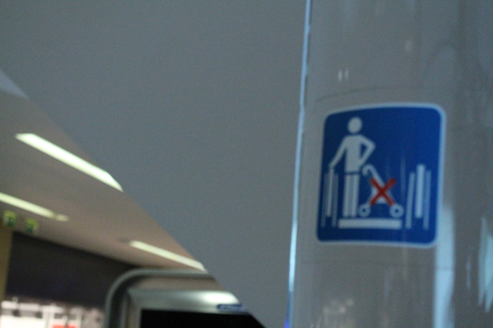
Infographics //


These are all different in their meanings and visual identity, yet share commonality as well known and understandable symbols. The 'no pram permitted' and christianity symbols may not be spotted within everyday life, yet I feel these are still easily related to their intended meaning despite the increased complexity. The idea of colour and shape informing the design of a symbol/ infographic is outstandingly important for its readability. As humans we subconsciously associate different colours/ shapes with different meanings- it is essential to play on this mental framework in any future design ideas.

Signage// 


The Trinity Shopping centre was an interesting case study where signage and colour are concerned. It seemed each level had a different colour to complement its 'identity' and clarity for shoppers of all ages to understand. The use of arrows and simplistic infographics are easily recognisable as a lift/ escalator, alongside places to eat. However, it seems it is not enough to simply have an infographic without the complementary text so not to arise confusion. 


As Marks and Spencers is aimed at an older demographic, the signage and route planning is very clear from as soon as you enter the door. Not only are the aisles clearly formatted into walk ways and red routes for shoppers, the large overhead signage (complemented with lights) is directly in customers eye line, giving instant directions. This is important for older generations especially to defuse confusion, alongside providing clear, concise information if they just want to go to a specific section. 

In contrast, younger shops such as TOPSHOP or TOPMAN are designed in an entirely different way. Ambiguity seems a key aspect of signage within the shop floors, encouraging shoppers to browse the circumference of the shop floor- ideally to draw them to other items on their travels. Arcadia is a huge fan of the 'red route', meaning shop floors are constructed with 'best sellers' and complementary items in the shoppers direct gaze, yet then other key pieces and basics (such as Denim) slightly off this manufactured route, pulling their attention in a zig-zag motion. With this in mind, the use of signage is slightly surplus (other than 'DOWN TO MORE WOMENSWEAR'/ 'UP TO TOPMAN' as younger people shopping generally want to browse, which is definitely the stores intention.


Leeds Train Station //


The signage throughout Leeds Train Station (and most other rail stations) are very consistent, clear and leave no room for confusion. Despite purposely coming through a smaller exit, from entrance it was clear what way to walk. This may be partly due to the corridor lay out, yet also the fluid use of arrows and complementary type aiding the infographics. Furthermore, as National Rail's guidelines for signage, type and infographics are so consistent with colour, shape and even X-Heights- even someone oblivious to the design could instantly recognise that they all work together- highlighting the necessity of harmony within signage.

Interesting street signage //


76, located on Wellington Road has an extremely unique 'to let' sign, compliment with the composition of the metal door signs. The elongation of the '6' breaches the square surface area, meaning a higher degree of cost would be needed to produce to allow for this overlap by using a larger scale material. The effect it creates is diverse and modern, suggesting that signage and information graphics can come off the page, exploring new realms of life in the outside world. In addition, this sign grabs my attention every time I walk past it through the rounded use of Obliques and a classic typeface, juxtaposed by the contemporary style via the extension. If I remember this sign, in theory other people may too?