Adaptation of Massimo Vignelli's grid for bookmaking. Still relatively simple in structure but more concisely designed for the cover- as well as the inside and how to implement type onto the cover. (if landscape A4). At the moment, landscape is the most appropriate way of displaying the images properly, allowing the photo book route to go ahead.

 |
| How the grid system could be used in the book |
 |
| Possible typeface for the front cover. Custom typeface inspired by the images inside and contextual research into Harley Davidson. I created this on Adobe Illustrator, inspired by an older H.D Typeface |
I reduced the stroke of the typeface, making it more gender neutral in its appearance and structure, including all sub-catergories of the target audience, including Ladies of Harley. Throughout the 21st century H.D have tried to bring a neutral aesthetic and typeface to the brand, not being overtly male all of the time (take Image V, H.D Chester tent in Helvetica Bold). Helvetica by nature is suppose to be universally legible and inclusive to all- the fact Harley are using it is definitely a step in the right direction in terms of equality amongst the culture. However, this publication is not looking at modern typefaces- really, the more unique the better. A small serif still remains, hinting to the traditional routes of Harley, whilst not looking too different from some typefaces found on patches and t-shirts.
 |
| Implementing the Grid |


A consistent flow is achieved by a smaller grid, rather than a four column structure, giving me (the designer), more freedom when positioning images on the page. This is also a consistent link between the inside and outside of the book, meaning when it comes round to producing the cover, everything will maintain the same flow.
 |
| Experimenting with an A4 Portrait layout and alternative grid systems. Despite knowing I will conclude on landscape for the image scale benefits, Portrait has its benefits for informative design and lots of copy. It also sits better on the shelf. (see below) |

Despite this, the benefits of landscape still outweigh the benefits of portrait. Now its just a matter of scale to consider and concluding on a grid system/ layout.
After further consideration, the layout of the book is most effective landscape, this slight hangover the edge proves this book is 'special', not like the rest, and hopefully will encourage the consumer to treat it like a collectable (which it is).
Colour schemes
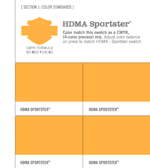
I found the Harley Davidson packaging standards guide online, complete with CMYK reference codes. As the colour was on screen, it was easy to colour pick from the document and match it to a Pantone reference code.


Colour picking key colours to fit the theme


Unable to reproduce HDMA Orange through an accessible digital print process. The best way around this would be screen printing and mixing inks, but even then thats no guarantee of precision, and may take more time than it's worth (?).

No comments:
Post a Comment