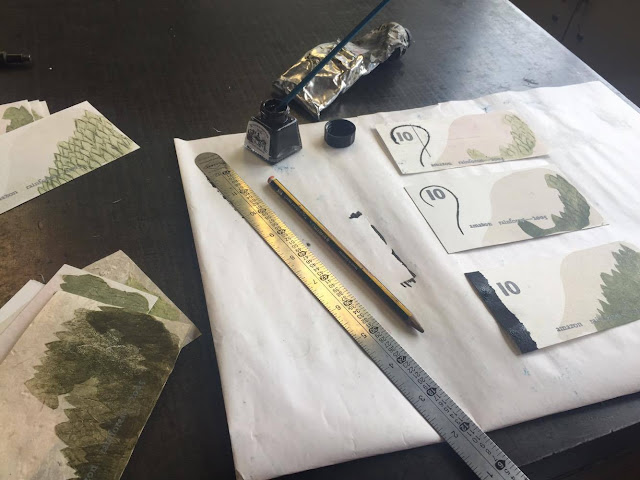
Creating a letterpress chase is simple yet time consuming to get right. By introducing furniture and leading to hold the typeface/numbers in place, a chase is created (shown below), allowing consistent continuous letterpress prints. I experimented with the Adanna letterpress, using Adana printing inks relating to my previous colour scheme and deforestation. I found it really difficult to lock the chase in place due to the scale of the typeface and where the letters/number needed to be positioned in order to print effectively. As prints were so inconsistent when the chase was locked in, I created a mini template positioning my note on a larger piece of stock. By doing this it allowed accuracy through traditional print, alongside giving a larger surface area for the Adanna to hold onto providing more security.
Problems arose throughout the letterpress process, the first with the 10 digits selected. I opted for Gill Sans 48pt for the number 10, providing a strong modernity through it's san-serif structure. I felt this contrasted well with Johanna, 18pt providing a softer serif traditionally, an aspect balancing out my brief nicely. Unfortunately, the first 1 0 in Gill Sans was cut off at the top, resulting in an unfinished ascetic when printed. To resolve this I had to disassemble the chase and re allign. This is definitely something I will look out for in the future when letter pressing.
 |
| First prints of Letterpress onto lino |
Foiling is something I have attempted before, yet was unaware only certain types of inks are compatible. I cut out 'Champagne' and 'Copper' foil, placed it face down and masked it in place over the black area. My intention was to create two sets of three, one with champagne foil and the other copper.
Final bank notes and Evaluation //
Due to many technical difficulties, my final print is no where near what I expected it to be. Through sheer negligence on my part I overlooked a huge part of the concept, forgetting to re-set the dates and digit on each note prior to printing. Looking back, I got so into the letterpress process I didn't even remember they were all meant to be individual to show transitions. This is definitely something I will alter in the future, with a reprint of the notes occurring in HiJack week ready for the exhibition. The notes will be remain a 10, yet say 'Amazon Rainforest_2005/2010/2015', showcasing a flow. Despite the handmade papers being very experimental, I feel the most effective prints have occurred with the use of Suffolk Handmade Paper without any ink or foil. The effectiveness is created through a gentle style, looking very 'hand made' in ascetic and incorporating a selective range of colours, I don't feel this is fulfilling the potential of my personal brief, as it still remains unegnagine and neutral. At the present I am not happy with my outcome not do I feel I have met my expectations for the brief though the limited development or experimentation with other successful processes. Time management is something I will take from this, giving myself more time for inductions and time to perfect each process, avoiding issues such as foiling in the future. In conclusion, I am not happy with my final outcome and plan to complete to a satisfactory standard prior to the exhibition. In the future I will concentrate more on digital processes, realising my passion is definitely swaying more towards digital and editorial over traditional print.


No comments:
Post a Comment