Friday 30 September 2016

OUGD504- Publication + Grid Research

John Tonks- 'Empire'

John Tonks 'Empire', is positioned firmly as a documentary photography book highlighting the many colonies within the British Empire. His photographic journey takes us all around the globe, exploring some remote and unknown cultures.


As a practitioner Tonks mainly shoots medium format film, the quality is preserved and there is no worry over a solo digital file getting deleted or tampered with. 400 rolls of film went into shooting 'Empire', so the body of photography the viewer does not get to see is still staggering. This shows that good practice takes, patience and often real immersion into a culture to truley document it- especially for a project like this. I find myself inspired by Tonks, as the emphasis is soley on the images and copy remaining limited.
Looking back at my own set of images, it is a shame NOT to collect more, especially with the Harley scene quite in reach. Despite this not being attainable for this current moduel as the riding season has finished, I would like to continue documenting Harley over time, possibly producing a real investigatory journey in future years.
The simple layout means the viewer is free to make their own interpretation of the images and investigate them for what they are, rather than fighting through overcomplicated design to find the message. The typography featured looks to be Caslon, a proud british typeface by nature. The serif structure of the letterforms are antique in appearance, they almost look like they've jumped off an old pirate map and made their way onto this beautifully signiture bound hardback. The rustic aesthetic of the font contributes to the quality of the readers experience, not too overbearing but not oozing modernity. The typeface is in keeping with the concept of Tonks' Empire, and lets the viewer know automatically they are being taken on a quality journey through time.
The manufacturing of the publication is relatively conventional. It is cased in a hardback with signiture (and then glue) binding. This quality bind suggests you can go anywhere with this publication; wether thats to the Falkland islands to look for yourself, or for it just to sit on the shelf and be a reminder of whats out there. Unlike other perfect binds which may come appart over time through use- there is no doubt that will happen here.

Pentagram, The Compendium : Produced by Phaidon


When investigating publications with the emphasis on Graphic Design, I was curious to see how the leading studio's did the task. As a manual is by nature a collectable, I felt this was a good place to start.
The publication is hardback in a dustjacket, which then slides inside a protective hard casing. The anticipation the viewer feels when sliding the book out of the case for the first time- especially if ordered or purchased from new, must be quite exciting. At present, the work is boxed away, hidden in its unexpecting and untelling box-home. There is little on the casing, nor the dustjacket cover. This suggests that elaborate artwork isn't needed, the target audience will be enticed just by the name 'Pentagram', so the ambiguity of the cover is perhaps preventing anybody picking it up who may not appriciate it the way it is indended to be appriciated (eg. Non designers).
A simplistic, modernist layout is fluid but millitary in its approach. The using an 8 column grid system to allows uniformity but is flexible enough to make each page unique, avoiding repetition. As a compendium, by nature it is a different intended experience to a purely photographic publication. Here, body copy and imagary work in harmony, with images complementing the well-considered words which give them life. I intend for my images to speak for themselves, swaying me away from the intergration of images into text as featured here, simply as it would not be appropriate. Instead, copy should complement the images rather than explain them.
As a large publication (just below A3, 3:4 ratio), the perfect bidning has come loose with use, hence the application of bookbinding tape. This is an appropriate solution as the thick tape is infitting to the aesthetic of a manual, yet this would be less appropriate in a sleeker publication, such as John Tonks 'Empire', making the emphasis on a secure bind really important.

'An Illustrated Guide to Harley Davidson'


Pages were ridiculously tightly bound down the spine, to the point it was hard to turn the pages and keep them open. A very unpleasant reading experience. Possibly produced like this for cheaper costs and the compromise of quality. However, if this publication was to be used (for example) in a garage environment- sturdy bind is needed but not to the extent you can't see what the pages are saying.


Typeface Helvetica Neue, legible and modern in aesthetic despite being around for years. Harley Davidson have since taken on Helvetica as one of their standard typefaces for publication use, as well as on stickers, tents and some shop signs. Perhaps Harley are trying to 'move into the 21st century' and become gender neutral through aesthetic as currently all the emphasis is on the male's consumer needs- whereas actually both men and women own and ride bikes these days.


Tall and slender, this softback publication is at the lower end of the Harley Davidson book chain, acting as a pocket book for Harley facts.
Positioned as more of a manual into motoring, the mechanics and specifics to the bikes, the emphasis seems to be on conveying the information as concicely as possible- rather than on aesthetic quality (such as introducing negative space). This is to be expected for 1) the price and 2) the nature or WHAT the book is and WHO directly it is for. The target audience buying or receiving this book will be solely interested in Harleys. Probably male, white, 40-65, with enough disposable income to follow their passions and act on the decisions and information they read in such books. To target to this, information needs to be kept to what they want to know- in this case, purely about Harley's as a machine.
This publication uses a 4 column grid system, allowin rigid blocks of text and a noticable flow from one page to the next. Simple imagary is inserted where possible, again working to the grid and allowing additional copy to fall around it harmoniously. The images are much like the text, for practical purposes only, rather than giving a sense of utopia or escapism through imagery.
From a design aspect, the type of bike has been grouped together by the coloured band at the top of the page- increasing ease of use for the viewer. Eg: if they are looking for a bike derrivitive of a Soft tail, they look in the pink section. However, it was interesting to note that Red type features on the cover (and throughout the whole publication), rather than Black/White and Orange. The use of Red as a substitute for Orange is quite dangerous, as it is quintessentially known throughout the biker world as Hells Angels ONLY colours. The use of incorporating red is a bold move, suggesting that the publishers who made the book may be somewhat controlled themselves by the HA 'machine'.

Hells Angels Motorcycle Club: Produced by Merrell, composed by Andrew Shaylar and Sonny Berger

It is interesting to note that Sonny Berger was the original founder of Hells Angels M.C, so by him explicitly helping in produce a book to explain the culture is almost juxtaposing the whole concept of having it. The Angels have always been built on privacy and secrecy, now many of the first generation HA's have started 'selling out', selling their story for big money. This does not mean that what we are seeing is a true, accurate representation. After speaking to a member of Hells Angels, it was clear that Berger's influence into modern biker culture was not an invitation into their world- simply a sell out. "Everything still goes on just as it always did, it's just more underground now, they show you what you want to see, not what its actually like".
My publication isn't really touching on anything to do with The Angels as I have no real connection to them, yet in the future the project could always span to documenting a real H.A Rally, such as The Bulldog Bash in the summer. The rally I photographed is the opposite in attitude to Hells Angels, as they class themselves as 'the 1%'. The 1%'res are their own breed with no regards for societal rules or the law, giving the negative connotations we all know to be associated with biker culture some truth. My photographs show the 99%, the good law abiding citizens who find a freedom in Harley- rather than the possibility of prison shackles.


Also positioned as a Photography/Art book, Hells Angels is a documentary photography project focusing in on the most notorious Harley subgroup. The publication includes portraits, documentary shots, interviews, riding shots and factual bike shots. This has so far been the only high quality publication produced in relation to Harley which encapsulates the sense of community and lifestyle which accompanies the act of riding.
The images are shown large to preserve quality, featuring a mixture of Black and White and Colour photography, all to a very high standard. The publication itself comes as hardback or soft back, suggesting a huge print run to meet the demands of the consumer. This shows their is a market out there for books of this nature, not just looking at the bike as a machine, but the clubs as a way of life.

Grid Systems
In response to what I have observed, I created my own grid systems to be implemented into the publication.
The Vignelli Canon is a good insight into WHY Grids are important, alongside basic grids to follow and how to create harmony on the page. I also investigated 'the perfect book'. This is how many modernist designers, such as Jan Tschichold described this system. It was also discovered that the Golden Ratio is often a factor in all beauty, and can be found in many many things. Again, this will be an influence to create page harmony amongst positioning images and aligning photographs. 

"Not the ok book, nor the pretty good book, but the perfect book."


'The Secret to Page Harmony' - http://retinart.net/graphic-design/secret-law-of-page-harmony/


Own Grids:

Massimo Vignelli grid. Simple 4x6 column grid, allowing a simple structure and uniformity on the page. This gives room for guttering and margins, whilst giving the designer the freedom to make of it what they will.

I broke some grids down into exact pages, so they would be easily transferred between InDesign, Illustrator and Photoshop documents.
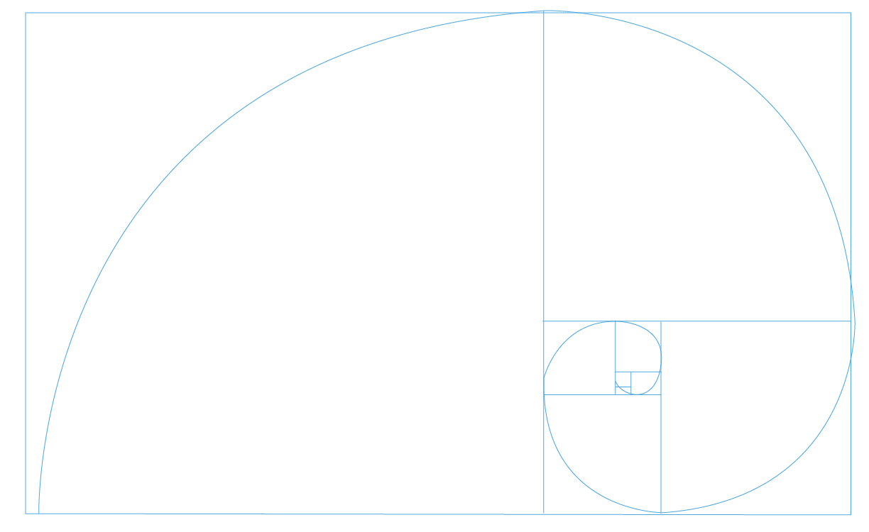


The Golden Ratio:

Closely related to the Fibonacci Sequence, the Golden Ratio is a common mathematical ratio found in nature that can be used to create pleasing, natural looking compositions in design work. Its used to describe the perfect symmetrical relationship between two proportions. 

Approximately equal to a 1:1.61 ratio, the Golden Ratio can be illustrated using a Golden Rectangle: a large rectangle consisting of a square (with sides equal in length to the shortest length of the rectangle) and a smaller rectangle.


Wednesday 28 September 2016

OUGD504- Type in Context: Initial Image/Concept Feedback

Type in Context briefing:

"Design should be based purely on its intended function, not based on ascetics". Form Follows Function theory, commonly associated with the Bauhaus as a modernist philosophy. This theory is derived from regal architecture, beautiful but unfit for the public realm. Ascetics are pretty meaningless if the book is not fit for purpose.

Initial Idea > Production. Clarify the idea and be considering production processes from the start. e.g.: Type for a purpose. If laser cutting type, counters in O's will fall out so needs to be stencil-esq typeface.

Thoughts:

Production as Craft and utilising the Form Follows Function process may prove to be essential when dealing with my content. The purpose of the A-Z: Type in Context brief is to explore typography within a specific setting or geographic location, suggesting a clear copy type to showcase a clear legibility. In addition the book will be positioned as a art/photography book. Again, who the target audience is cannot be forgotten. After speaking to them in extensively about art and design, it is clear their expectations and desired resolution is different to mine. As the target audience predominantly seems to be men (often 35+), it is clear they mainly want to see pictures of bikes, rather than of type. As I am developing an interest in Typography, especially after watching the Helvetica Documentary in conjunction with this brief, I would like to focus the publication more towards this- but I need to remember designing for print is designing for the audience, not myself.

With this in mind I want to explore how the two could integrate together. What copy to include will be difficult, especially as I have little knowledge about bikes. This will require constant development, research and analysis to create the most contextually relevant copy.


Study Task 01 :
Group Presentation


As my documenting images are quite high quality, generally with busy composition in a B&W documentary style. I feel these images are what will attract the target audience more than the insights and specifics to do with HD Type. Harley Davidson has easily the largest social aspect alongside the motoring, and through talking to these people at social events one thing resinates- they love pictures of their bike. It seems all bikers are vain. After spending thousands of pounds, consistently every year (Harleys are notorious for breakdowns), Harley is a commitment only for the obsessive and the love of their bikes. In response to the summer brief exploring Harley Davidson culture. I have prepared a 3 minuet presentation in which I will discuss my intentions for the brief. 

I plan to ask the group:

-If the images shown are too repetitive?
-How they feel about the current layout and use of illustration?
-Any concerns they have with the brief?
-How could the concept and content further appeal to the target audience?
-Wether they feel the removal of identity is too impersonal? 


Alongside the following slides, I plan to explain in my own words where each image was taken and why. I feel the context behind my images are half the story, so the accompanying text is very much a work in progress. As the presentation is only 3 minutes, I chose 6 images- 30 seconds on each.

An introduction to the images and documentary nature. I will explain that by shooting on Black & White 35mm rather than digital this reflects the grungy tones and context shown.


Feedback:


-If the images shown are too repetitive?

Not if the layout is well considered. "The images need to have the right flow.

-How they feel about the current layout and use of illustration?

"Some of the target audience may get put off by illustration, as often older men aren't drawn to illustration"
"It could posses too many feminine qualities"

-Any concerns they have with the brief?

"No, just choose a path to explore. You've pretty much got the target audience there so work to it"

"It could become intimidating to someone who isn't in the bike community if its all knowledge and pictures of bikes, there needs to be the aspect for a wider target audience"- with this in mind, I intend for the secondary target audience to be design conscious young professionals, interested in sub-cultures or societal studies alike (?). This means photographs such as the Marlborough packet (and other non-bike related typographic artefacts) could play a big part in telling


-How could the concept and content further appeal to the target audience?

"Just emphasise what they like"

-Wether they feel the removal of identity is too impersonal? 

"No, I didn't really notice to be honest"
"Its quite relevant after you explained the secrecy of the culture, especially with the negative and violent connotations"

When considering the production of the book and the viewer imperticular, it is most appropriate for the images to be the main focus in the publication. With this in mind, a landscape layout would work better, as the majority of images are working in a landscape 35mm frame, however a grid would need to be created in order to accurately position content and allow consistency. 

I will need to explore both 3:4 ratio's and International Paper sizes to work with different grid systems. After reading about the 3:4 ratio, I want to incorporate expanding design knowledge into my practice. This seems to be an effective way of designing books, and it would also 

Through other knowledge of Harley culture, many aspects are shrouded in secrecy and ambiguity. The Hells Angels will always be a notable reference to biker culture, Harley Davidson in particular  There are also copyright aspects to consider, especially if the bar and shield icon is used.

When considering the copy for each image (if any), the message could go one of two ways. 
Either way, it needs to remain concise and insightful. It could either flowing together to make a coherent observation of Harley Davidson type in context- meaning the title of the book would remain the same. Alternatively, I could pursue a more marketable route and give the direct target audience what they want- 
An overview of what the chosen image means in terms of: what bike it is, any historical references, a special connotation or intertextual reference that link to a wider knowledge of Harley Davidson*. 


*Sourced from informal research at Chester Rally when talking to the target audience about what they'd like out of a Art/Photography publication 


"Design should be based purely on its intended function, not based on ascetics". Form Follows Function theory, commonly associated with the Bauhaus as a modernist philosophy. This theory is derived from regal architecture, beautiful but unfit for the public realm. Ascetics are pretty meaningless if the book is not fit for purpose.

Initial Idea > Production. Clarify the idea and be considering production processes from the start. e.g.: Type for a purpose. If laser cutting type, counters in O's will fall out so needs to be stencil-esq typeface.


Production as Craft and utilising the Form Follows Function process. Eg: The purpose of the A-Z: Type in Context brief is to explore typography within a specific setting or geographic location, suggesting a clear copy type to showcase a clear legibility. In addition the book will be positioned as a art/photography book. Again, who the target audience is cannot be forgotten.

As my documenting images are quite high quality, generally with busy composition in a B&W documentary style. I feel these images are what will attract the target audience more than the insights and specifics to do with HD Type. Harley Davidson has easily the largest social aspect alongside the motoring, and through talking to these people at social events one thing resinates- they love pictures of their bike. It seems all bikers are vain. After spending thousands of pounds, consistently every year (Harleys are notorious for breakdowns), Harley is a commitment only for the obsessive and the love of their bikes.


When considering the commercial viability to the book, I feel in a very fortunate position. As I have been immersed in the Harley culture my whole life, it has become so evident this is a collectors culture. More often of not, members of HOG have a higher disposable income and are prepared to spend silly amounts of money on anything slightly related to Harley- even more so if it touches on their bike model or something personal to them.


Target Audience

-Aged aprox 30-65.
-Interested in Harley Davidson motorbikes, probably a longstanding/ life member member of HOG.
-Appreciates good quality and unique collectables produced to a high standard.
-Higher level of disposable income, possibly at the mid-end of career span.
-Often little knowledge or care about art and design. Photography would be the most interesting aspect to engage the client

When discussing this brief with the target audience, I asked how much they would normally spend on a small Harley collectable- wether it be official merchandise from the dealership or an independent niche project. The results weren't that surprising, with some individuals saying they have "spent over £200 on a Harley book before"-Dave Cook, 56, business owner.


Tuesday 27 September 2016

Home Developing Film

After re-considering what typography I would explore, I decided to almost travel back in time and go to alternative places from my childhood. As my family and both immediate parents are heavily into the Harley Davidson scene, visiting Rallys and group trips was very common throughout summer. Despite not being involved in the bike scene for years, I thought this was a good opportunity to photograph an otherwise unremembered UK sub culture, whilst literally taking photographs down memory lane.

I shot on a Pentax K1000 manual, adjusting aperture and ISO throughout the day in accordance with changing conditions. As I wanted to expand my knowledge of working film photography in practice, it was essential to consider black and white as an educational aid, as this is the only one I can develop myself. As the Vernon St campus was closed on the day I opted to develop, a photographer I know offered to show me using professional home methods.


Gather equipment, ideally in a kitchen or bathroom. Liquid will be spilt, be ready.

Method

Heat water:

Heat water to 20 degrees c and measure with a thermometer. Our water was consistently 18 degree's raising the issue of under/over exposure if not quite hot enough. To counteract this problem, I added water at 24 degree's, raising the overall temperature with room for external cooling factors. This gave slight room for error, I was advised by a photographer friend slightly hotter than cooler, advice I followed.

Develop & Shake:

Pour developing agent into tank for 9 mins, agitating every minute for 10 seconds a time. After this is completed pour the developer our and wash for 10 minutes.


pics

Pour developer out and wash for 10 more mins. After this, pour the fixer in for a further 6 minutes and agitate for 10 seconds every minute once again.

Wash:

Pour fixer out and wash for 3 mins.


Cleaning Solution:

Fill tank with water and a few drops of Ilfosol wetting agent, agitating constantly for around 3 minuets. Gently lifting and dropping the spools of film up and down into the water, allowing the agent to rinse between each layer providing an even coverage was a good method.


Unraveling the spool of film and exposing the negatives to light for the first time


Hanging the negatives :

Hang the negatives up to dry placing one peg at the bottom as a weight down. This straightens the film whilst drying. You could do this and hair drier the negatives, yet this risks increased dust speckles and distortions. I let mine dry for around 1 hour 20 mins, making sure they're bone dry before scanning.


Scans :