Video- Digital element
 |
| Start - Middle - End on mobile viewing |
Touch Point
Tote bags are increasing in popularity, cheap to produce and easily transportable and recognisable. As tattoo's are essentially art, the tote bags could simply be art works in their own forms, highlighting the message with a commercial agenda for Monotype.
At this point, the touch point was not really our main focus as we were all concentrating our efforts on the posters. I was put in charge of tote bags, so created a range in my own style which I felt best reflects the aesthetic of the brief. I opted for a black cotton tote over white canvas, which would require a white thick-ink screen print to keep the product quality high. A small Monotype M would appear as the side tag, peeking out from the corner of each design. Anna and I worked collaboratively on taking these from concept to design.
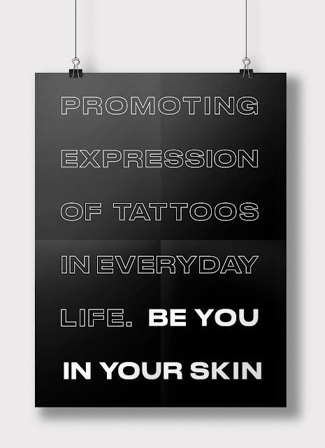
We wanted to keep the branding consistent across all platforms, so I used the typesetting Rob previously created to outline what would be said on the bags. After that, I had the luxury of selecting from a wide range of artworks to apply as additional details. I used a mixture of everyones illustrations and photographs of Rhiannon's tattoo's to further convey the tattoo iconography.


No comments:
Post a Comment