Monday, 24 April 2017

OUGD503: Project Report

I wanted to use the opportunity to submit to both major platforms, D&AD & YCN, learning about their processes and aspects of professionalism. I wanted to take on briefs which I had a real interest in, aiming to produce thoughtful and highly considered to work a high outcome. I feel that this aim has been met, with the standard of production increasing throughout the module. The Greenalls Gin brief for YCN was my biggest challenge, due to the head space I was in at the time organisation was all over the place, meaning lots of work kept being erased or unsaved, and then re-done under un-allocated time restraints. This aspect of organisation is something I really need to focus on in the future. In past evaluations I speak of how I need to improve time management, fortunately that was the one thing which may have gone right for the majority of this module, submitting to all deadlines on time (at least submitting something). By conducting this brief I have questioned my current time plan for the future, adding an extra two weeks at the end of every project for errors bound to occur. Never the less Studio brief 01 was a great opportunity to be free (to an extent) in production and development, yet was extremely challenging as narrowing down the idea was something I struggled with. More feedback would have aided the development of this brief more coherently, as well as perhaps targeting the overall problem in a more immediate manor. By introducing a festival aspect to Greenalls, the emphasis is placed on the millennial audience, yet requires additional investment and support by Greenalls and participating events- something which hinders the feasibility of this solution. I have learnt that I enjoy boundaries, as they give a set of guidelines and a rough path to follow; the challenge of creating 'a piece of creative' is too broad for my brain to handle, suggesting as well that Greenalls didn't really have a clear outcome in mind either.  

However, Studio brief 02 was a great opportunity to collaborate with other Graphic Designers, utilising time effectively and project managing to an extent. I feel my role within the group was significant, contributing to ideas, concept development and production. It was really rewarding to feel valued within a group, and that my ideas actually matter and aren't stupid. My input aided the overall black and white aesthetic of the project, an aspect I feel ties the corporate world and gritty subculture of tattoo's together in harmony. This brief allowed me to develop my own skills, mainly centred around photography, illustration and art direction. I helped organise the group (ironically) and booked things so they would get done within enough time for completion, contributing to my own personal development in time management and project planning. All small briefs have mainly been illustration based, inspiring this aspect within my personal practice and adapting a more hands on style. The benefit of a small brief being short is the lack of blogging this opportunity provides. I feel this freedom allows me to explore my ideas much more, yet its the documentation which holds me back- something I need to work on in the future.


In conclusion, Responsive has been a really thought provoking journey forcing me to expand my creativity and consider the overall purpose/problem in what the brand is asking for. Each brief has taught me about how I work and has led me to realise that I need to drive my passion for ideas I really believe in, as well as collaborating with others in the process. I also need to be more alert when it comes to organising files, creating multiple back ups in multiple places so not to loose all my files again. 

OUGD503: Monotype D&AD Submission

Presentation Boards


Evaluation

Exploring Studio Brief 02 has been my favourite module by miles due to the endless possibilities multiple pairs of hands could create. This brief led me to realise that I do actually have good ideas and some level of skill which can contribute to a functioning team, as well as finding a strength in project management. The benefit of working with three other graphic designers is that everybody understood the technicalities and necessity to develop a concept, and in turn relate that too the brief; rather than working with illustrators who don't follow the same design processes as us. Looking back on the module I would have found it beneficial to collaborate with someone from another course, when considering the development of the brief an animator would have really been favourable. 

The overall aesthetic and stylistic quality is a product of my input, initially through editing and then discussed/appreciated within the group so carried forwards. We worked really well as a group, with no person overshadowing the collaborative process or taking charge. The distribution of work was fair and even, with everybody focusing on playing at their strengths. 

I am extremely proud of the final outcomes for the Monotype brief and feel they have been a success visually in communicating a brand identity and concept for Monotype. The development into looking at tattoo's was never what I initially expected when expressing an interest in the Type Up Culture brief,  and without the discussions with collaborative partners I made, the resolution and concept would never have been more developed. The benefit of splitting workloads and delegating aspects of research gave us our own specialism, not overlapping information with others and therefore wasting time. The brief was conducted to a strict time plan, which Anna and Myself made sure we adhered to so to get the resolution produced and developed before the deadline. In the future I plan to explore working collaboratively across more platforms, and now know from experience the standard of work which can be produced with the right team.

OUGD503: Art From Non-Art 04

Success! Despite not receiving an email confirmation saying my piece would be featured, I was contacted by a friend on the opening night saying that two of my pieces had made it in! I was shocked that two pieces were chosen as the majority of other applicants only had one print exhibited. Sadly I missed the opening night, a i would have relished in the opportunity to meet new creatives and network at an event I am part of. 

By competing the design process in such a short period of time, the designs did not become stale or dull and were created in conjunction to subjective thoughts and feelings. This way of design was incredibly beneficial (tangibly, developing collages with hands and being in full control of the outcome), which I felt a very rewarding aspect. The experience of doing the competition without the presence of a company to design for was much unlike the others I have completed (Papyrus and Display Wizard) which were heavy and intensive on research to be fit the design with the purpose. I feel that my design has been successful for this brief due to the creative, playful element attached and coded within the subject content, rather than getting too bogged down on specific design decisions (like you would with a larger brief).The freedom of experimenting with collage and 'art from non-art' has given me confidence in my creative decision making and will encourage me to submit more one off concept vs aesthetic based work in the future. 


Piece No 1

Piece No 2


Monday, 10 April 2017

OUGD505: Traditional Printing

After finalising my A3 Poster design, the detail and consistency that needs to be replicated were most suitable for screen print. I decided to expose the outline, rather than individual colour blocks. This gives me the opportunity to experiment with backgrounds/ colour blocking with mono print and Lino methods, overlaying the screen on top. I feel the incorporation of mono print is somewhat essential to link to the concept.(?)

As deadline work is quite tight at the moment with lots due in for the 24th April, I wanted to get the print done within good time, so made sure I was alert to my time planning. The screen exposure process was relatively simple, once I figured out the correct steps with the UV Emulsion and how the process worked.

As exposing the screen took quite a while due to learning errors, I started simple with one colour prints to see what ideas I could generate for backgrounds or alternate colour combinations. With this, I plan to develop a colour pallet as a guide to work to representing the Bowie iconography, as well as retro lively atmosphere of the event. The composition has lots of potential to insert colour, so I want to utilise this tastefully and effectively. 

I had previously created a few quick mono prints to test the effect. Colour colour also be implemented by one flat roller colour- glitter/neon/UV printing inks can allow depth and tone with colour, an appealing quality over digital print. 


Initially cleaning the screen to reveal the design.


I am quite happy with how the initial test prints came out. After learning more about the process and equipment I discovered the prints were moving (and unalligning) because the vacuum was not on the vacuum bed. This is something I now know and will hopefully improve the quality and accuracy of prints in the future.

I also plan to investigate stock options further; I have currently printed a silver, black, red and white onto bright white card, off-white watercolour paper, newsprint and black card. The white/silver on black was highly striking- implementing some red and blue may be an idea?

The ease of screen printing (once the screen was coated/exposed) was quite easy, but I need to remember to maintain a clear pressure on the screen as I am printing- and perhaps add more ink for a bolder design. It is clear why people use this form of traditional print as the versatility and possibilities available with it are inventive and accessible, printing in mass scale on fabric, stock, packaging etc. 

Colour Palette 


Sunday, 9 April 2017

OUGD505: Ziggy Stardust Poster (Development 2)


Feedback //

After pushing this design as much as I could, something still wasn't working, so I conducted some feedback to see what could be improved. The negative space/typography ratio was something of concern. At this stage, I felt the development was quite clean yet channeling a postmodernity- I wanted to go back to the drawing board to try and give everything a synthesised flow. 

- Experiment with Hand Drawn typography, go back to sketches and see what works best

- Not sure about feet illustration at both sides

- If going for a groovy typographic style it should all fit in together, like the posters of the 1960's. (*Despite being influenced from 1960's posters, the gig was in the 1970's after this genre had faded slightly, furthermore Bowie does not incorporate a Jimi Hendrix psycadellic illustrative style in any of his works- so going all out in illustrative typography may not be totally relevant).

- Keep the type to just the outline, reflecting the illustrative style you've used.  

- Scatter elements of bold type, contrasted with delicate skinny type (perhaps Groovy vs San Serif)        
                                         
   - Don't try and overcomplicate the composition of the typography, keep everything to the same wave flow.

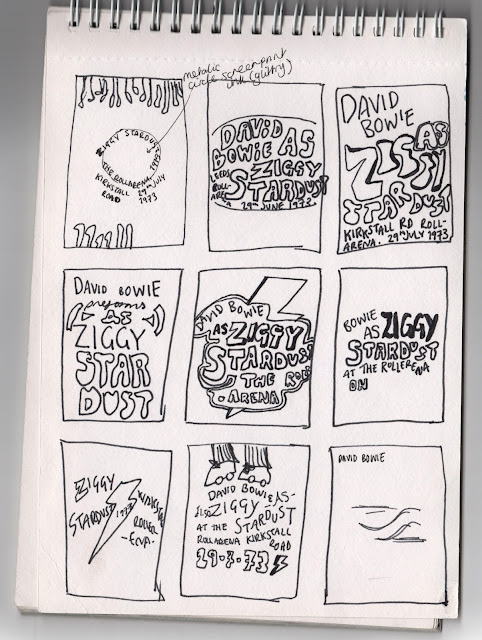
More sketches with a closer emphasis to typography


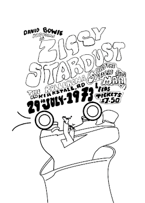
After creating a outline drawing, I scanned in the page and cleaned it up slightly on photoshop. Unaltered and un-minipulated at this point. I implemented this design into some poster mock ups from the previous illustrations, seeing if the tone of voice was right, as well as the type flowing well. I plan to go back into the design and rework it for each composition- altering the 'Mars' and the accidental mark by the T. By using photoshop and Illustrator I have the ability to adapt the design, creating outlines for each letterform- perhaps creating an alphabet long term.


Recapping to Bowie Illustrations

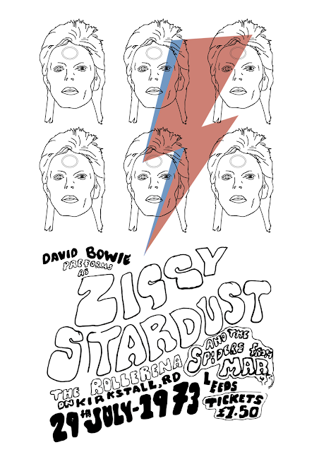
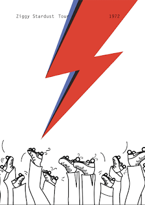
As David Bowie has so much widely recognisable iconography, it is essential I touch on at least one familiar aspect to encourage a familiar interaction between the audience and print. As Bowie preformed as Ziggy Stardust, the main piece of iconography present in the 1973 gig was the gold alien circle and a black and white retro-lightning bolt. The Rollerena tour was only a few months prior to the release of Aladdin Sane, where the debut of the red and blue lightning bolt was made. Despite not being iconic at the time of the July 73 gig, the print is intended for a modern audience so their perceptions of Bowie are probably strongly related to the lightning bolt, as it was his most popular and recognisable symbol.


After looking at these and getting feedback, I decided to push it further, clean up the hand rendered typography and concentrate my attention on these three- narrowed down from feedback.


Reworking the typography


Cleaning up the typography, removing any unwanted marks on photoshop. After listening to feedback, it seemed the hand rendered presence was quite complementary to the traditional print style, so decided to keep some imperfections for authenticity. I altered kerning, leading and some stroke widths to emphasise fluidity and impact. I decided to alter the second G in 'Ziggy', replacing it with the same G as before, making the typeface (and hopefully design) look more cohesive and polished- rather than a sketch
.

3 Alterations of the same type design, incorporating the movement of the Rollerena venue

I plan to expose these designs onto screens, experimenting with coloured stock/ink combinations. To incorporate a roller print technique, it would be interesting to see how creating mono-printed backgrounds would look. Coloured blocks could highlight the sections of legs or typography quite intricately, or expressive roller marks could be made in the form of a mono print.  

If time was more forgiving, it would be interesting to try and laser cut the design into wood block (or Lino), to create a traditional stamp effect, allowing a roller based practice rather than screen print, following the concept of fluidity further.

Wednesday, 5 April 2017

OUGD505: Photographer documenting the culture of Rollerena's

Bill Yate's documentary photography series, exploring the Sweetheart Roller Skating Rink,1972-1973. This was of particular interest as this is the same year Bowie's concert was hosted at a Rollerena in Leeds. Despite the cultural differences in Yates's photographs and the reality of West Yorkshire, his photographs are set in Six Mile Creek, Hillsborough County (Tampa) Florida.

His photographic series is hugely important in understanding the culture around the venue at the time, as well as the whole mood of the 1970's to best represent this in my print. As I have done some development at this point, I wonder if incorporating a photographic (screen printed) element would be a path to consider. The escence of his photographs have deep tonal qualities and convey a sense of realism towards youth rebellion and gender. The subjects in these photographs were possibly too young for Ziggy Stardust's target audience, but to the energy around these locations can effect everyone.

Yate's Sweetheart series was originally captured in his early days of photography. He wanted to capture the essence of youth, at the part the teens were transitioning from 'kids to adults'. His photo series was placed away in a drawer until the negatives were found many years later. Yates made a photo book showcasing his images, as well as curating an exhibition at the Ogden Museum.


Bill Yates used a combination of 35mm and medium format film for his images. The mixture of quality and gritty tones give this method of photography a slight edge in my opinion; furthermore, if these were not shot on analogue, its questionable if the raw files would still be available and accessible today. 

OUGD505: Ziggy Stardust Poster (Development 1)

Recapping on the enjoyment of small briefs like this one, I see a lot of similarities between the deliverables for this and for Secret 7. As all we need is one traditionally printed exhibition print, we are given a certain amount of freedom as there is no set functionality the poster needs to deliver. The main things it should be is eye catching and conceptual for the most audience engagement.

<Ideas mindmap> 

Initial sketches

Capturing movement and highlighting the Rollerena as a unique venue. I tried to incorporate the 1970's flares, as seen in the photo series of American Rollerenas in 1973. This iconography hopes to add an element of nostalgia-  even if the design does not come off as successfully as I would like, the audience should still know the gig was in the 1970's by incorporating visual signifiers and the playful elements of postmodernism.


Experimenting with digitising my drawings, turning them into digital illustrations manipulatable for a range of developments. Quick start on experimenting with type- trying to capture the fluidity of the event, whilst channeling the poster styles of the 1970's and rock and roll iconography.


Experimenting with Typography (Orator STD Typeface). I wanted to suggest to the juxtaposition between then and now- venue wise. The Rollerarena venue is no more, so I wanted to reflect this modernity through possible typographic choices.

As the piece is for an exhibition, I wanted to increase audience participation as much as possible, intriguing the viewer to get more involve with the piece. Inspired by a juxtaposition in history and public spaces, the tight condensed binary code aesthetic is a visual look at the history of the rollerena. Once used as a place of youth passion, sweaty gigs and fun for everyone has now become the ITV building on Kirkstall Rd. After some more research (and going to the building reception and speaking to a caretaker), its interesting to think that where the gig would have been, ie. the physical stage space and events room, is now home to the IT Dept, working mainly in binary code. The typography complies iconic phrases from each song in the set list, starting with White Light White Heat (the phenomenal start as commented on in articles), and ends with the encore, Drive In Saturday. Throughout I have tried to organise the lyrics in a sense that they are still coherent as a melody when you read through. No more than two lines from each track have been used, incorporating ambiguity and off-tempo sections to give the viewer the feel of a real song. The typography was positioned so small so the viewer in the exhibition space must interrogate the images, stand in front of it for prolonged periods of time (hopefully) to unravel the concept, as well as getting lost in Bowie lyrics as a narrative journey through the concert. 
However, as the exhibition purpose means the print must be eye catching and engaging straight away, and I'm not sure if this has that 'wow' factor that Bowie does- nor does it fully represent the sweaty rock and roll rollerena venue (as the space in Leeds).