Monday, 22 February 2016

Product Photography

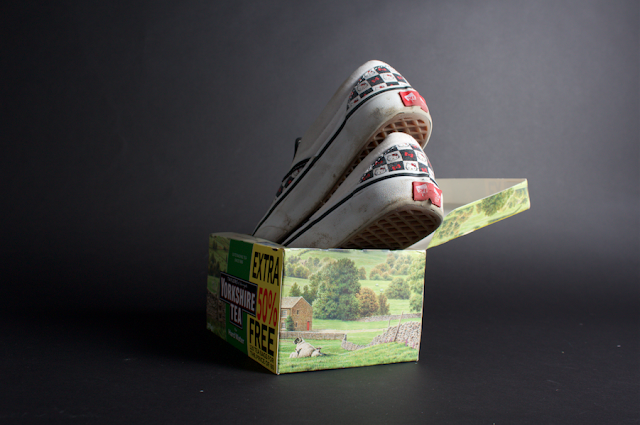
Todays induction had us exploring photography lighting, with special attention to photographing objects. As we were in the studio, controlling the lighting was fairly manageable due to the lack of natural light intersecting the ambience. After a thorough briefing on how to work each piece of equipment and why we need it, I decided to photograph something that represented me- the shoes on my feet.


Experimenting with high key lighting in a studio environment. Subtle depth of field has been created through manual mode and specialist focus through the lens. The lower angle suggests a product preview style shot, similar to ones found on clothing websites. This angle is slightly more obscure due to the lower camera position and shadow, making the image slightly more interesting than being higher up and candid. 


Experiments with ISO and further depth of field. No additional lens was used, simply additional focus via manual.

On the translucent studio table with no flash and no lighting rigs in action. A simple iPhone torch was used below the surface to bounce light off the object, therefore acting as a DIY low lighting set up. This creates a eerie effect, yet the image quality has been seriously compromised through the higher than normal ISO needed to absorb the light. 


Unfortunately when uploading the images the image quality has been seriously reduced due to the file type (CN2) not being supported by Blogger.

Friday, 19 February 2016

OUDG406// Secret 7" Final Critique

After creating a number of album covers for both Art School, The Jam and Imagine, John Lennon I presented a selection of my favourites to the final critique for feedback. As the Secret 7" requirements also include a 160 character description, covering inspiration and concept, I incorporated possible commentaries for further feedback. The 160 characters includes punctuation and spacing, proving a real challenge.


I asked //
// Do you feel my captions appropriately represent my designs?

The overall result was mixed, proving that the captions definitely need more work to them. With this in mind, before sending off finals I will thesaurus selected words to make the articulation of my concepts sound more professional. 

// With regards to colour and composition, is there any one album cover you think is most effective?

This again was very mixed, however almost everybody had different opinions on the most successful outcome. As nobody voted for the Yellow Rhino sleeve, this has been illuminated as a possible contender for 'final piece development'. Both the green baby sleeve and both Art Schools proved the most popular, yet by adjusting the shape of the spiral/ reducing negative space may strengthen this design. In addition, I will seek further feedback from possible photography students/ higher levels to see wether the contrast on the 'art school bedroom' needs to be increased, as I personally feel a muted contrast perpetuates the surroundings in a more appropriate way.

(half way through the crit I added)
// Can you tell the baby designs are for Imagine by John Lennon?

The majority of the feedback said no, yet this was good as the ambiguity made the pieces more intriguing. Intriguing and ambiguous was my intention so this is a success for me, yet I will continue to look at ways to make this more effective.


Evaluation //

Despite my artwork not making it into the Secret 7 competition, I am still happy with the progress I have made throughout the module. Prior to starting this, I was relatively unsure on the correct use of the creative cloud, with the pen tool being one of my weakest aspects. I feel I have achieved my intentions, creating a random selection of album artwork with some more appropriate than others. This has so far been my favourite brief, allowing me to explore creativity without restrictions, something I definitely want to explore further in the future. I feel I have somewhat met my aims, broadening my creativity and conceptual awareness of design. However, many concepts could have been pushed further and explored in more ways to create even more unique pieces. Perhaps a hand rendered quality digitally manipulated would have lead to further conceptual development, leading to a spot in the show. In the end I submitted all 5 album covers and feel the digital quality may be the weakest factor.


OUGD406// Secret 7" 02

// The Jam - Art School

After considering the ideas generation for Art School, I felt the strongest connection to this title without even listening to the song. I am in Art School, therefore subconsciously in my own way I represent this part of Art School. To showcase this, the idea arose to photograph my bedroom in its organic state, not tidied or with objects placed for decoration, showing who a art student really is behind the paint splattered stereotypes.


Heavily edited on Photoshop with the adjustments of Curves and Gradient Maps. I wanted to keep the colours bright and vivid, with a subtle Cyan overlay giving a slightly trippy/three dimensional ascetic. 


Inspired by Photo-art, I dug up an old Action Sampler photograph I had taken last summer for a brief reflecting 'normality'. The concept behind the image was an ordinary lad in his ordinary surroundings, highlighting a very prominent sense of the working class. This piece has been heavily inspired by the stereotypes of art students, suggesting that all our efforts and unseen artwork may someday just spiral into nothing- hence the toilet swirl ascetic.
Another creation for 'Art School' inspired by hip hop and typographic album covers. The hand rendered 'Thinking bout life' suggests that all art students do is 'think about life', which personally I feel is bang on. Without pondering every tiny thing no artwork with a sub-meaning would ever be created, defying the point of art as a everlasting genre. Without a link to a true event, who is the art intended for? I also included the Parental Advisory warning, further linking to the Hip Hop inspiration yet suggesting that Parental Advisory is needed for thinking about life. This undertone is playing on the culture that our thoughts are controlled and our thoughts can kill us, questioning if 'thinking about life' is really a good thing or simply a self-destructive tendency. 

OUGD406// Secret 7" 01

// John Lennon- Imagine

Optical illusions have been created through the digital manipulation of type, proving for an intriguing typographic series of covers. The type is featuring the results of the world becoming united and together in peace. I projected this through the typeface Baskerville, giving an aged ascetic similar to old documents- suggesting a shock factor that things such as 'Gender Equality' is a new thing.
A digital medium has been used to emphasise crisp detail, alongside traditional vector imagery. Furthermore, the covers need to be digitally uploaded to Secret 7" so this eases the deadline process.
The black and white contrast highlights each word/ statement, forcing the viewer to pay attention. After experimenting with distortions and seeking peer critiques it became unusual that all people could see slightly different things within the curves. This may be the result of a happy accident, yet for me I can see a strong elephant with his tail towards the viewer, whereas a peer could only see a dolphin jumping into a wave (?). This will be interesting in forms of dividing opinion, alongside suggesting that nothing is ever what it seems, a metaphor for the world/humanity/ accepting everyones own opinions.  


A tripper take on the previous design, with the type overlaid giving a more confusing/disjointed ascetic. The use of vivid Fuchsia and Cyan together is to emphasise the unity and fluidity of males and females, alongside creating a 60's psychedelic vibe. 
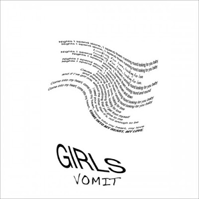
After getting really involved in this design, I was unfortunately made aware of a similar album cover already out there for 'Girls', Vomit. The fluidity of the wave and the three dimensional typography create strong links between our work, despite me never seeing this before. Due to this, I have decided not to take this optical illusion style forward, especially for a competition brief, incase it looks like I have copied 'Girls'.


To resolve the problem arose by Vomit, I tried to create a purposeful optical illusion with the same block of text. The intension was for a Rhino, one of the latest animal types to become extinct through human disfunction. Other people when asked can see a Tigers Claw and an Elephant with their head tilted. It seems with this illusion, when you can see one object its really hard see another. 
The life of John Lennon was partially spent fighting for innocent throughout the world, highlighted by the hit 'Imagine'. With this in mind I wanted to represent innocence in its purest form where we are all untainted and the same. Playing on the ironic truth that only wise people, grown ups or even men have the ability to change the world, I combined an old wise head onto the body of innocence, suggesting that anyone could make a change. In addition, the representation of this hybrid old man baby is quite humorous and 'random' in ascetic, possibly making unknowing viewers assume that this figure is designed for a band more incline to that style, e.g.: Chverches/ Tame Impala.


Repeat pattern with subtle differences. The top half has each baby slightly different, while the bottom are all the same, suggesting difference and equality according to the lyrics of Imagine.

The foetus design has been duplicated into a sequence of three, reflecting how many times the 'Imagine...' chorus is used within the song. The change in colour suggests that we are all the same no matter our skin colour or ethnicity, an idea inspired by United Colours of Benneton 'Black/ White/ Yellow' campaign. However, the date is incorrect, the 1990 should be 1971 as the release date for 'Imagine'. 
Minimal compositional factors seemed to be the most effective through informal critiques. Inspired by album covers such as Biggie Smalls', Ready to Die, I adapted the 'wise foetus' design to be floating in a sea of nothing- simply 'blah'. The viewers attention is drawn to the crisp white lines contrasting the flat background; this could possibly be complemented with a parental advisory sticker on a bottom corner suggesting you need parental advisory to think.

 For this cover, the colour brown was selected to reflect retro-ism and the whole 70's ascetic as a whole, leading the mind to the simpler days where peace could have some day been an option.

Taking inspiration from publications such as The Independent, the introduction of a side column including the year John Lennon was assassinated is a subtle clue, alongside breaking up the composition. The dark green is to suggest regrowth and the possibility that someday 'you and me will be as one', alongside being a general connotation to peace and environmentalism.  

Thursday, 18 February 2016

OUDG406// Album Art - Research

Exploring a range of album covers from both known and unknown artists. I aim to consider colour in relation to tone and purpose, as my initial ideas are predominantly black and white.


Jack Johnson uses a duotone pallet to emphasise mood and possibly minimise production costs. The tonal photograph overlaid highlights the background in a simple but effective manor, a technique I will definitely consider when I come to produce my own. In contrast, the Alt-J covers on the right oozes colour and fluid waves, possibly reflecting to the beat/waves within each track. The presentation method of the vinyl half out is also a really effective touch when it comes to presenting future work.

On the theme of exploring colour, Vampire Weekend's use of toned photography brings a deeper depth in colour in a more organic way. This style reminds me of analogue processes and lomography as a whole. I always assumed texture is a hard aspect to convey through album covers, yet this photographic style with the shadows onto textured paper fully breaks the boundaries of what I considered a stereotypical album cover. Furthermore, the central composition in both is a effect I feel works really well for the minimal style of each sleeve.

Wednesday, 17 February 2016

OUGD406 // Secret 7 Initial Sketches

After circling and selecting my favourite and the most appropriate ideas from the mind maps previously created, i created initial sketches visualising possible outcomes. Whilst I was in this process, I also documented other quirky ideas that came through the development process, introducing a comedic undertone popular within the art-music movement. I wanted to explore a ambiguous style rather than overly obvious, however not unrelentingly random.

As I want to look to create as many album covers as possible, I haven't selected one single track to take further. I plan to experiment with a range of album covers, whittling down to the best ideas. 
All sketches have underlying meanings relating to the song connotations or lyrics. 


Bottom left is a simple illustration of a dream my flatmate had. They jumped out of bed into a see of darkness to witness a knife coming towards them. I feel the idea of conveying an actual dream for the track 'Dream 3' by Matt Ritcher is a clever approach, allowing me to investigate a range of ambiguous outcomes.


As perceptions and 21st century stereotypes of Art School are quite negative, I wanted to play on the humorous qualities created by art school stereotypes. Often "Art" is considered pretentious, hence why I opted for "Shut up you tosser". In addition, the scrunched up ball of paper with artwork on would be photographed in crisp detail, highlighting the real truth of art school, producing work you will inevitably hate. In addition, I wanted to explore Etta James's femininity and sexuality in a contrasting way to other female stars, possibly by just capturing her beauty mark encased in negative space. Other idea's were a continuous line drawing of Etta posed on a Piano, peers raised the point this would also be effective as a abstract oil painting, further highlighting the fluid tonal qualities of the song 'At Last'.


As Max Richer's track is intended for sleep and the creation of dreams, I wanted to look at re-creating funny/random dreams experienced by myself and peers relating to this concept.

Illustration idea for 'Dream 3' with a dream that happened to one of flat mates. In the dream Jesus was reincarnated into a fish and went into a takeaway, pleading for help. The takeaway man refused to help and gave a snide response. This is my take on that scene.
Initial outcomes //

After creating my initial ideas generations for each song, I found a humorous similarity between a few of the artists names. With this in mind, I chose to create a series of prep album covers experimenting with flat vector styles, a technique I am still getting use to. I opted to go straight to Illustrator for these designs, simply to get my technicality up on creative cloud whilst pondering other conceptual idea's.

John Lennon aka John Lemon 

Jack Garrett aka Jack Carrot

Matt Richer aka Matt Rich-er

Etta James aka Feta James
If this concept is praised in a future critique I plan to do 'The Jam' pot with marmalade/ strawberry jam oozing down it, continuing the series. Unfortunately I can't think of punny and funny names for Tame Impala and Chverches and feel the series will not be strong enough without them.

Thursday, 4 February 2016

OUGD406// Secret 7 Requirements

Professional Practice // Brief for Secret 7

Competition Briefs lead to Awards, Placements, Exposure, Networking, Prize money & Recognition!

Feather wallpaper company, based in Holland. They offer income for good illustrations/ typographic/ pattern design, definitely worth actively approaching!

// Secret 7

7 Tracks from 7 best known musicians, pressed 100 times and printed onto 7" Vinyls and sold for charity at £50 each. People don't know what record they're buying until they have parted for their money, its an opportunity to buy a piece of art worth thousands due to the big names that feature there.

//Rules
No artist name or song title
Only work to see whats on the front, include bleed
Produce in CMYK
300DPI
Save as TIF, JPG, PDF
Reduce file as much as possible (max 10 megabites)
Can upload as many as you like
23:59, 2nd March is deadline with upload proof
If design is chosen, keep it a secret
Include design insp. with written mini description (max 140 characters- inc spaces)
Can use a lyric or lyrics if appropriate

//Supported by & Judged by

SONOS Studios
Secret 7's Kevin
Universal Music Group
Monotype
Possible artists
BE AWARE OF JUDGES AND WHAT THEY ARE LOOKING FOR

//Dont

Be shy of concept
Over complicate things
Feel the need to keep it all digital


Initial Response to Brief //

For Secret 7 my intentions are to explore a range of abstract artworks, developing my ideas as I go. As I have a strong personal interest in the music industry and album artwork, I want to push my creativity to the limit in order to achieve ambiguous and conceptual outcomes. Despite digital submission being the most realistic, I may experiment with traditional methods to achieve a texture if appropriate or simply become more adapted to programs such as Illustrator or Photoshop. My aims are to produce a series of striking album covers, hopefully making it through to the exhibition.
As general Graphic Design is often very justified and for a purpose, the idea of album artwork being ambiguous and random appeals to me greatly, as producing an ascetically pleasing piece is paramount for success building on a solid concept.


I mind mapped out my initial ideas and responses to all Secret 7 tracks, listening to each song a minimum of 3 times. I tried to avoid watching the music video's as it was raised they are another creatives interpretation of the song, therefore not a unique idea. I wanted to explore sub contexts and connotations to the composition of the song, giving each idea a deeper contextual merit.

Tuesday, 2 February 2016

OUGD404 // Planning for a publication

This brief is to create a 10 page double spread booklet, on anything we like! 
As my main interest is Fashion publications, I felt that this was the perfect opportunity to incorporate my own professional and personal interests in one. The idea I was initially most attached to, was a styled photoshoot in various random locations, e.g.: cities, barley fields, the beach and other bizarre locations to create a narrative. 


Critique// 

After creating a mind map laying out the most appropriate ideas on paper, I took this to a group critique between Level 4 and Level 5's to whittle down which is most appropriate. I was/am really keen on using analogue cameras in some way, yet it was raised that this may detract from the clean effect I want to create. 

It was advised that embracing colour is definitely the way to go, as it should make the viewer engage further than if it was slightly muted or pastel-ated.

Avoiding gloss stock is needed to maintain a textural quality, especially if focusing on street style.

When I asked about composition it was agreed that it fully depends on the subject content, yet including negative space to draw the eye in, alongside possible zooms to break up the white may be a good shout- possibly experiment with darker stocks if appropriate for outer edges.

When brainstorming further as a collective over the photographic rights (asking people on the street for their permission), the idea arose to pursue the street style idea yet within Leeds College of Art. Generally, art students are much more accepting and agreeing to photographs for this purpose, as well as often dressing much more creatively, and looking more quirky as a whole.


When  this idea was created it was raised that I could include brief information on the garments, such as where if it was from if new. Alternatively, mark as 'Vintage'.

If similar items are in fashion at the moment, I could also include this in a concluding index, similar to a 'shop the look' article found in typical fashion magazines.

Possibly include a 'Tutors style' section?

For research I can look at fashion bloggers and style enthusiasts Instagram's for compositional inspiration, as well as seeing how they link the style to a place of purchase.